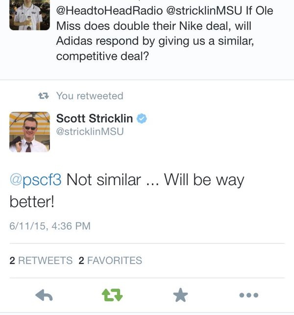
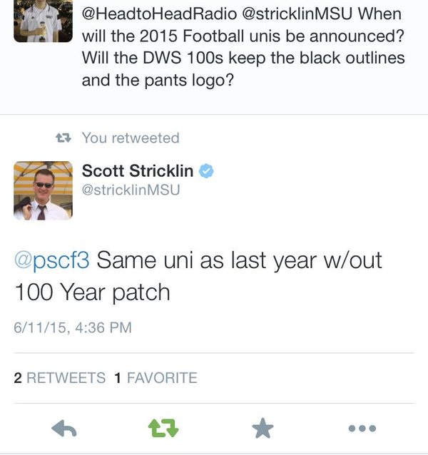
Earlier this week, Ole Miss athletic director Ross Bjork went on statewide Head to Head Radio and discussed things such as financials and uniforms. In addition to confirming that the Powder Blues would be back, Bjork shared that Ole Miss was looking to nearly double its current $2.05m deal with Nike. The fact that Adidas pays MSU more than Nike pays Ole Miss was a major argument I used in this article, so of course I was intrigued by this. Yesterday, Head to Head did a similar, albeit recorded, interview with Mississippi State AD Scott Stricklin. Unfortunately, that interview was not as interesting and no unknown information was revealed from it. However, curious as to a couple of topics, I shot a couple of tweets at Scott and he was nice enough to respond:
In the first, and perhaps more interesting, response, Stricklin claims that in response to a new Nike deal for Ole Miss, Adidas will respond with a "way better" deal for Mississippi State. This makes sense, given the competitive nature of the schools, and is consistent with the idea that Mississippi State is a priority to Adidas.
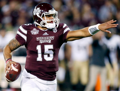
Secondly, we have official, yet disappointing, news on the uniforms for 2015. Stricklin says that the uniforms will be exactly the same as last year, minus the 100 year patch on the right chest. This means that the black outlines will remain, but what about the pants logo? By "unis", Stricklin could easily be referring only to the jersey, not the pants.
But how likely is it that the pants logo is removed? I wouldn't be surprised. One reason is because a poster on SixpackSpeak who was right about the black jersey (and also provided information on the "silver numbers" on said jersey) claims that it will be the case. Given that it would be an easy fix, I hope and somewhat expect for it to be gone. However, removing the pants logo still doesn't perfect the DWS 100 unis. I explain how that would happen below:
As I've said previously, Adidas is the best option, far and away, for Mississippi State. However, they have room for improvement. A good bit of it, actually. They commonly have bad ideas, and when they finally get a good one, they generally stop a step or two short (or one too many in the wrong direction) of perfection. And the sad part is that its generally just a simple fix. Examples include the "Ribbon Stripe" unis, which were a great concept but were poorly executed and wound up looking too much like A&M, and the Pinstripe baseball unis, which were prefect (and an Adidas creation) until Adidas over-thought it and added "Phillies Stripes", ruining the look. As it concerns the DWS 100s, the black outlines made sense for it being a throwback (the pants logo was never a good idea, but we'll get to that later), but are illogical for full-time use:
The helmet uses three colors: Maroon, White, and Gray.
The pants: Maroon, White, and Gray.
The jersey: Maroon, White, and Black.
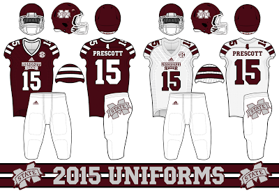
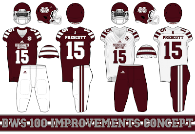
One of these things is not like the other. The black outlines, or the color black at all for that matter, has no place on a full-time Mississippi State uniform. And there is such a simple solution: replace the black with gray. It would fit in perfectly; the helmet already uses gray outlines, as did the "Ribbon Stripe" unis. Here's an idea at how it would look:
For the pants, the oversized logo should be removed. After that, either the pants should be left blank, or, as I would prefer, have stripes added in the same style as the jersey stripes. This would also allow for maroon pants; I shudder to even think what maroon pants with an oversized logo would look like.
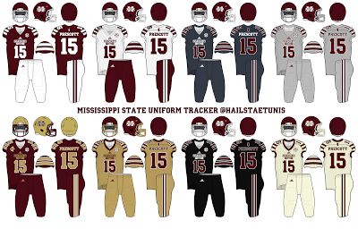
This design would allow for plently of variations, which I have mocked-up over the last few months for various reasons. A full collection can be found below:
So, while I am disappointed that moves will not be made to perfect the uniforms for 2015, it is nothing to constantly complain about. We can always hope that the improvements will be made, but the uniforms are certainly fine as they are for now. We can do (and have done) worse.....

 RSS Feed