With the MLB Draft being this week and the College World Series upon us, I've switched my recently football-driven mindset back to Mississippi State baseball this afternoon. As this past season slowly rolled to its final demise, many people, including myself, lost interest in the current season itself, not to mention the uniforms. Adidas slowly backed off also, with controversy and harsh reactions on twitter anytime uniforms were discussed, the 17 combos idea fell apart. Combo #2 was never worn, and I still have no idea was Combo #5 was even supposed to be. Adidas did continue their postseason trend of templated uniforms, giving them to teams like Louisville and Texas A&M. I have no doubt that there is a Mississippi State version of those that was left on a drawing board. Hopefully, had we been decent this year, they would have been relegated to the SEC Tournament or pregame.
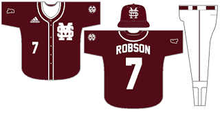
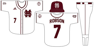
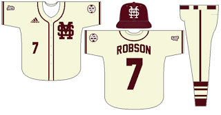
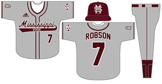
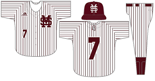
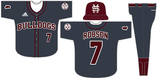
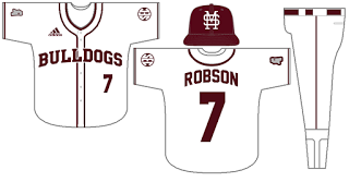
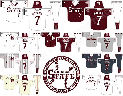
Anyway, I did some digging today and after a little Photoshop worn and Vector Magic, I now have an accurate version of the 85 "Mississippi State" wordmark. As you can see in the header and in the uniform representations used last year, I was forced to use a "close enough" version in the past. So, with that, and with my recently acquired Starkville font, I made the below concept to show what uniforms I would like to see Mississippi State baseball use in the future:
First, go back to the pullovers with the 85 wordmark. In 2015, the Bulldogs didn't even have a white jersey with the maroon wordmark. They had a St.Patrick's Day pullover with the wordmark in green, a black pullover with the wordmark in black with a white outline, and a maroon button up with the wordmark in white. Returning to the basics would be a huge step in the right direction, and I wouldn't be shocked to see it.
The Cream and Gray unis are great as they are; no changes there. The pinstripe unis, however, need to lose the Phillies stripes and go back to their 2013 glory.
Finally, one more less traditional, more concept-ish idea. Out of all the jerseys above, one thing is missing: a jersey with "Bulldogs" on it. Using the Starkville font, I created a Bulldogs wordmark and put it on two jerseys, a white one and a lead one. The white one looks better, but is there really a need for a 4th white-based jersey? That's where the lead comes in. It looks better than all black, the players would love it, and it would only have to be worn 3-4 times max. The Bulldogs have worn lead before, though the watermark MS ruined any chance it had at being decent.
These 9 unis would stay traditional while supporting up to 14 combos (gray and pinstripe pants with both maroon jerseys, plus cream hat with cream unis); we'd wear whatever templated garbage Adidas gives us in the SEC Tournament to get it out of our system, and the rest of the time, we'd have clean, traditional uniforms.
We can only hope.
We can only hope.
 RSS Feed