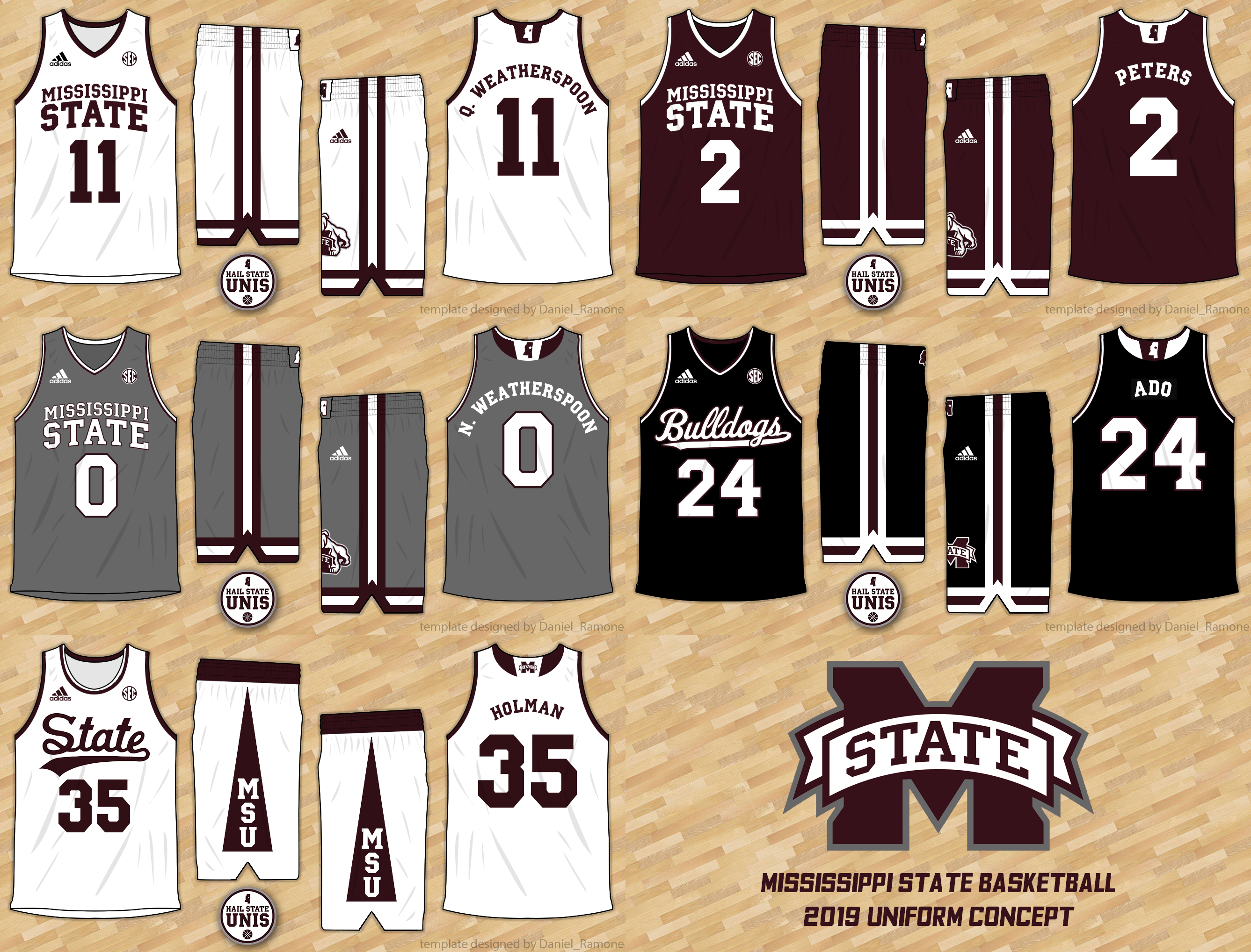
With its entire core group returning and a couple of highly regarded recruits coming in, the 2019 Mississippi State basketball team has an expectation of making the NCAA tournament for the first time since 2009. It would be ideal for the Bulldogs to be looking their best as they make a return to the national stage; the uniforms worn in the 2017-18 season were pretty solid, but a few changes could be made. Included in this concept for the 2018-19 season are:
Regular White and Maroon Uniforms:
The main thing you see people complain about with Mississippi State's primary uniforms is the "banner" logo on the chest. I personally don't dislike the banner logo, and I understand its importance as far as branding goes. However, I have to admit that there are some options that flow better on the front of the jersey than the banner logo. For this concept, I went back to the "stacked" wordmark worn from 2003-2012, using the "Starkville" font and using a slight arch, which prevents the static look that 2010-2012 had and calls back to the really old-school looks that used an arched "State." Other changes include moving the shorts stripes closer together and inverting the back of collar design.
Gray Uniforms:
Following the template of the white and maroon uniforms, the gray uniforms in this concept utilize a dark gray similar to the one used in last year's gray uniforms. The wordmark and uniforms are white outlined in maroon, calling back to the gray uniforms worn in the late 80's. The shorts stripes follow a similar pattern: maroon filled in with white. Last year's gray uniforms were a nice change of pace, but moving away from an Adidas templated design and going with a design more in sync with the rest of the Bulldogs' uniforms would be a substantial improvement.
Black Uniforms:
I wanted the black uniforms to have a redeeming factor to them. Realizing that State has never worn basketball uniforms with "Bulldogs" on the front, I thought that this would be a good opportunity to do so. While otherwise following the template of the white, maroon, and gray uniforms, the black uniforms in this concept have a script "Bulldogs" on the chest and replace the bulldog logo on the shorts with the M-State logo. This, in my opinion, gives the black uniforms a cool twist and allows them to serve a purpose other than "black for black's sake."
Throwback Uniforms:
The uniforms worn in the 2018 NIT opener against Nebraska should definitely return in 2019- the only change I would suggest is adding names to the back of the jersey- the numbers looked too low on the back and a name would fill the gap perfectly.
Other Uniforms:
I only mocked up those 5 uniforms, but I would love to see the cream "State" throwbacks return in 2019. Given that they were only worn once last season and new throwbacks have since been introduced, I feel like they might be retired for now. But I would love for them to continue to be worn a couple times a year.


 RSS Feed