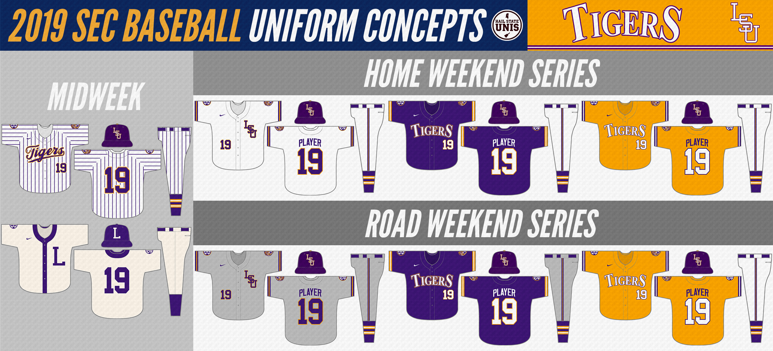
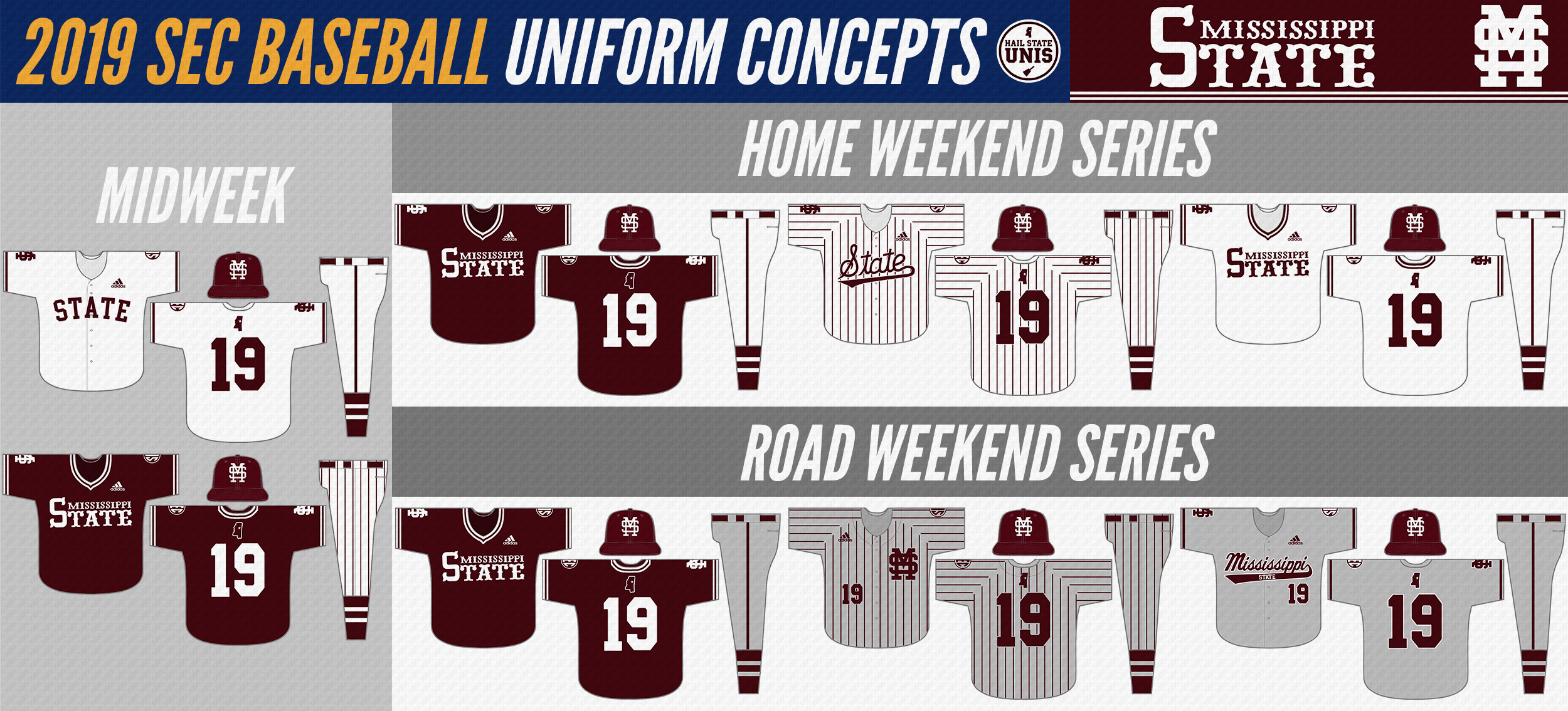
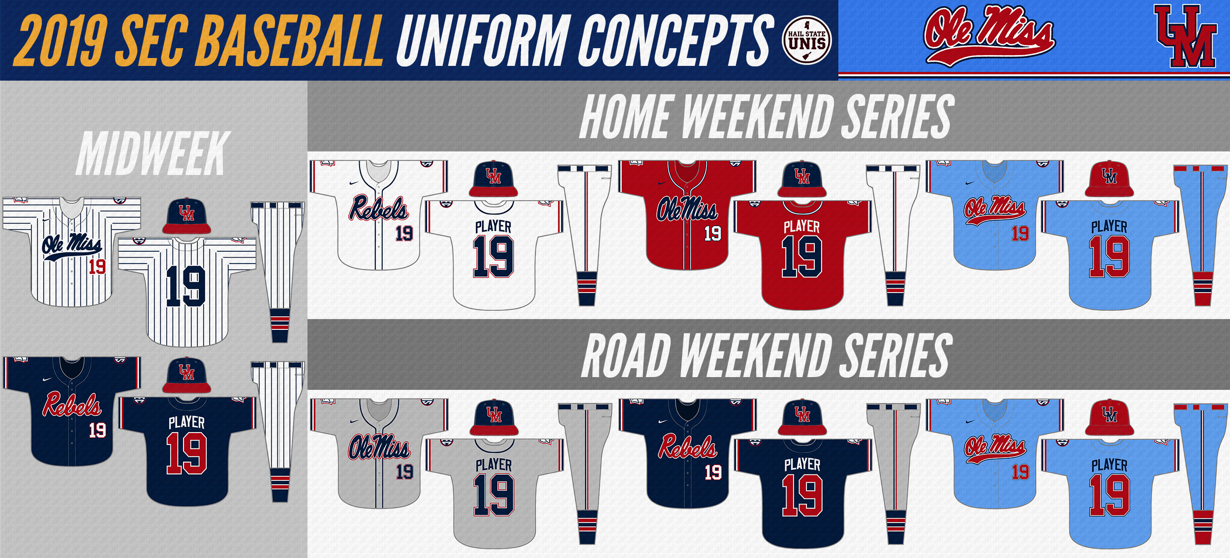
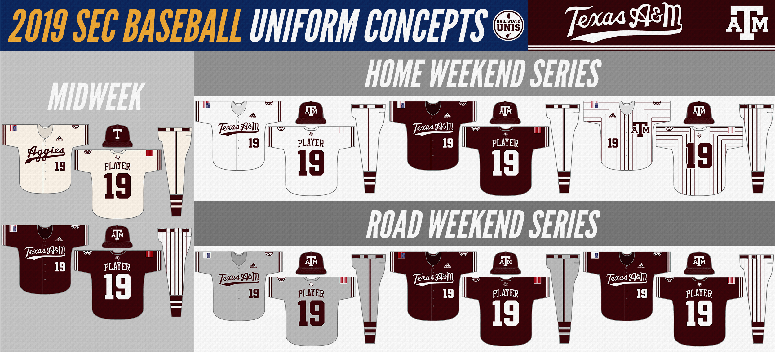
Every couple years, I like to do a uniforms concept series for all SEC Baseball (see the bottom of the page for links). This year, I did it in the format of defining the uniform rotation for all 14 teams. I listed out which uniforms would be used in midweek games, which would be used in home weekend series, and which would be used in road weekend series. This is not meant to display a set in stone rotation, as changes could be made on a week-by-week basis to create the best matchups and prevent any collisions (i.e. Alabama and Arkansas wearing red against each other.) This is also not meant to say that no uniforms could exist for these teams outside of their standard rotation; for example, I'm not necessarily getting rid of Mississippi State's black jerseys in this concept, they just wouldn't be in the standard rotation.
Enjoy!
Enjoy!
SEC WEST
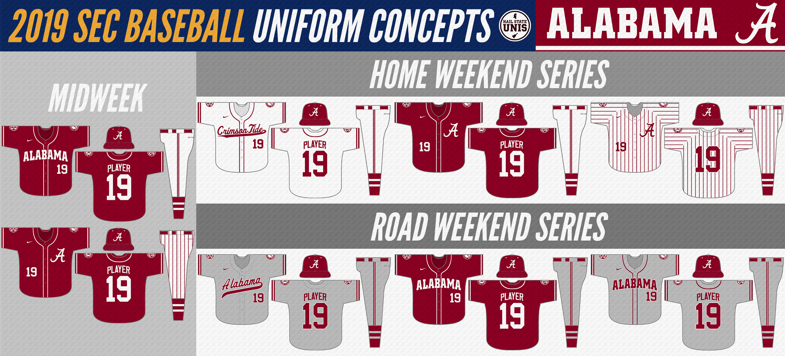
| Alabama Crimson Tide Alabama has some good elements to their current set that are retained here, such as the road gray scripts and home white pinstripes. This refined set includes two red jerseys, two gray jerseys, and two white jerseys, including the aforementioned pinstripes and a new solid white jersey with a "Crimson Tide" script. |
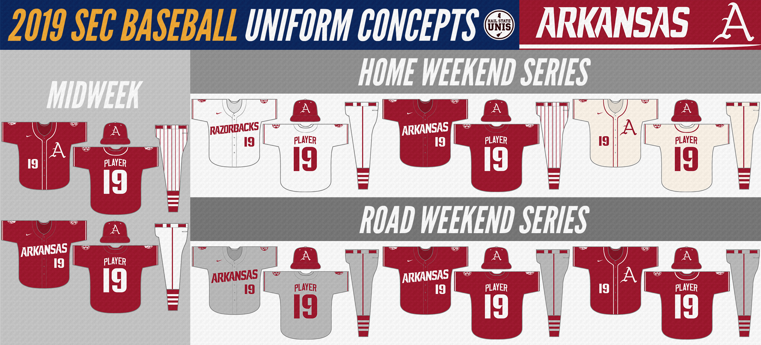
| Arkansas Razorbacks Arkansas has arguably the league's single best uniform in their Sunday cream jerseys, but the rest of their current set, despite having really good modern wordmarks, is plagued by Nike templating. This concept removes all arm pit and shoulder color fills, giving the Hogs a more traditional baseball look. A second red jersey, featuring the "A" on the chest, is added for midweeks and road game 3s. |
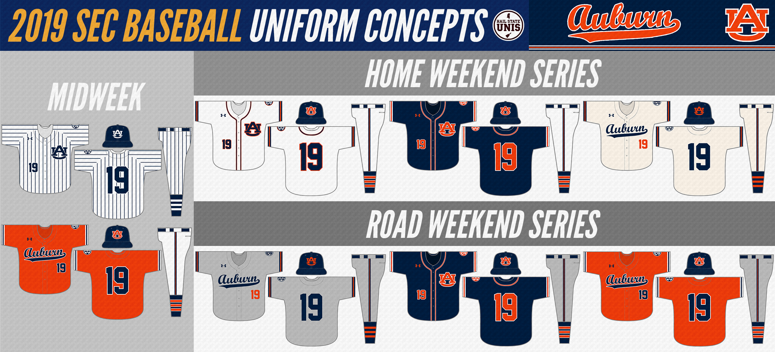
| Auburn Tigers Auburn has a decent set as is, but going to a more traditional number font would go a long way for them. This concept accomplishes that and also re-designs the white and navy jerseys to feature the "AU" logo on the chest with appropriate piping. The throwback cream jerseys are re-introduced, and the gray jerseys are modified to match their design. |
| Mississippi State Bulldogs Mississippi State has multiple "perfect" looks as is; the changes here are mostly to the rotation. The STATE throwbacks are moved to midweeks while the white pins and 85s are moved to the weekend. The gray script uniforms are brought back to match the current format and be worn on road game 3s. |
| Ole Miss Rebels One of the biggest changes made in this entire series is changing Ole Miss's hat logo to the interlocking "UM" full-time. Additional changes include adding the "Mississippi Landshark" logo to the right sleeve, streamlining the gray design, updating the "Rebels" wordmark, and changing the pinstripes design to one that is throwback-inspired, using the same wordmark as the powder blues. |
| Texas A&M Aggies The Aggies's 2019 look is a good one; this concept keeps the scripts that were introduced prior to this season, but makes a few tweaks. All of the jerseys are changed to a full button-up design to differentiate from Mississippi State; the base color of the "Aggies" jersey is changed to cream, and is still paired with the "T" hat. Finally, all bevels are removed from the set, including on the hat logo and pinstripe uniforms. |
SEC EAST
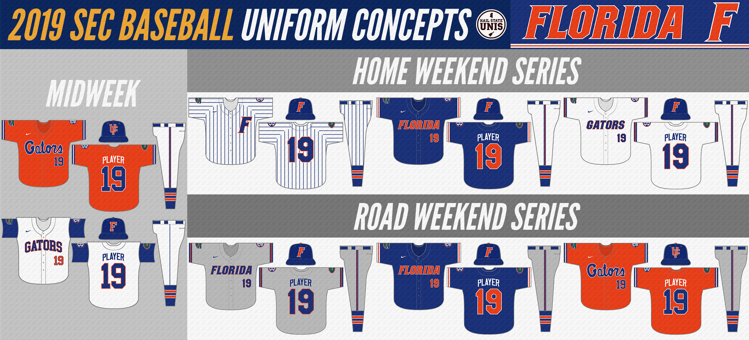
| Florida Gators Florida is an interesting team in that they have both good modern and classic looks. This concept re-introduces the classic orange "Gators" script jerseys and early 90s white vests, while retaining the (slightly modified) modern set in which they won the 2017 National Championship. Modifications to the NC set include the addition of the gator logo to the right sleeve and piping to the sleeves/pants. White outlines return to the blue jerseys. |
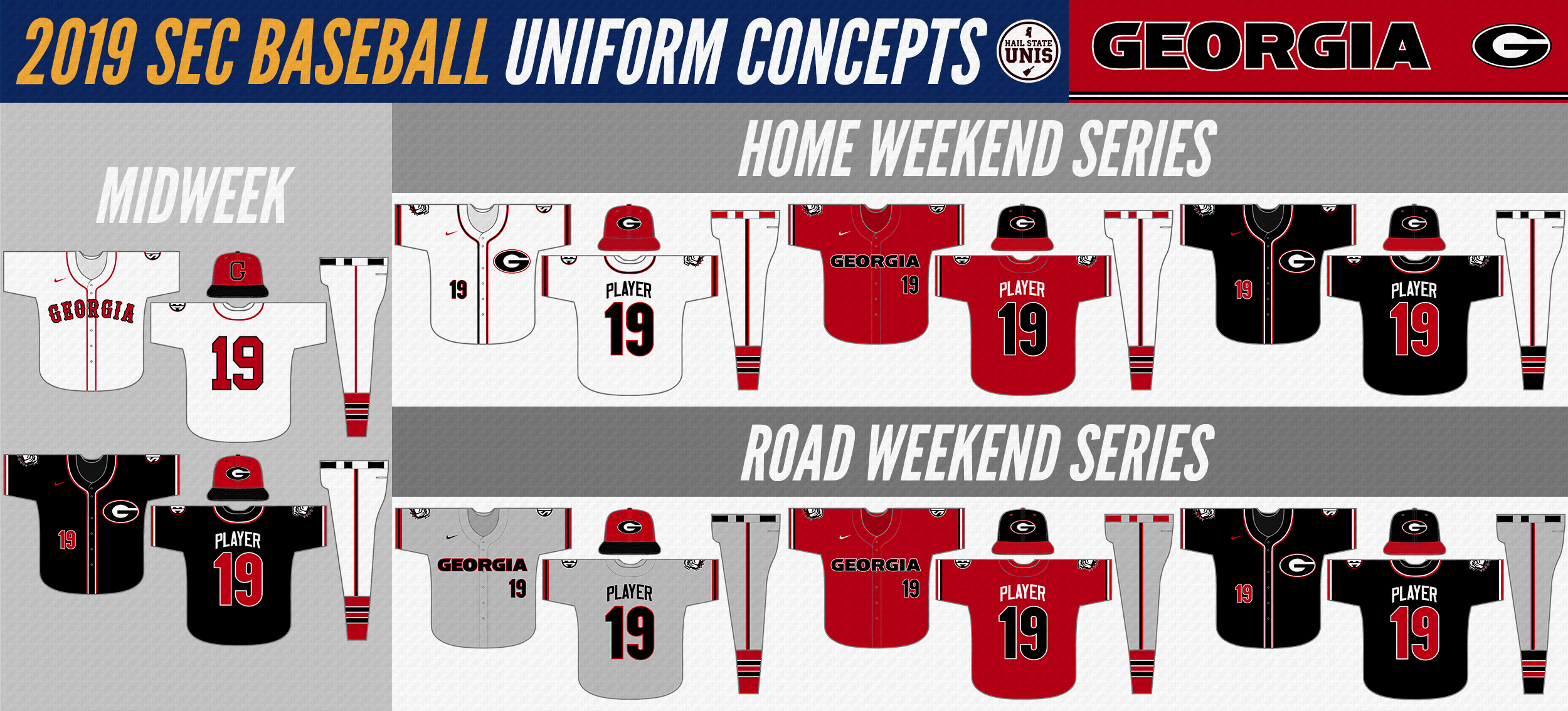
| Georgia Bulldogs It's easy to forget that Georgia has a national championship in baseball, but they do. The 1990 home uniform is brought back as a throwback option in this concept. The primary set is modified to feature the "G" logo on the white and black jerseys and the "Georgia" wordmark on the red and gray jerseys. |
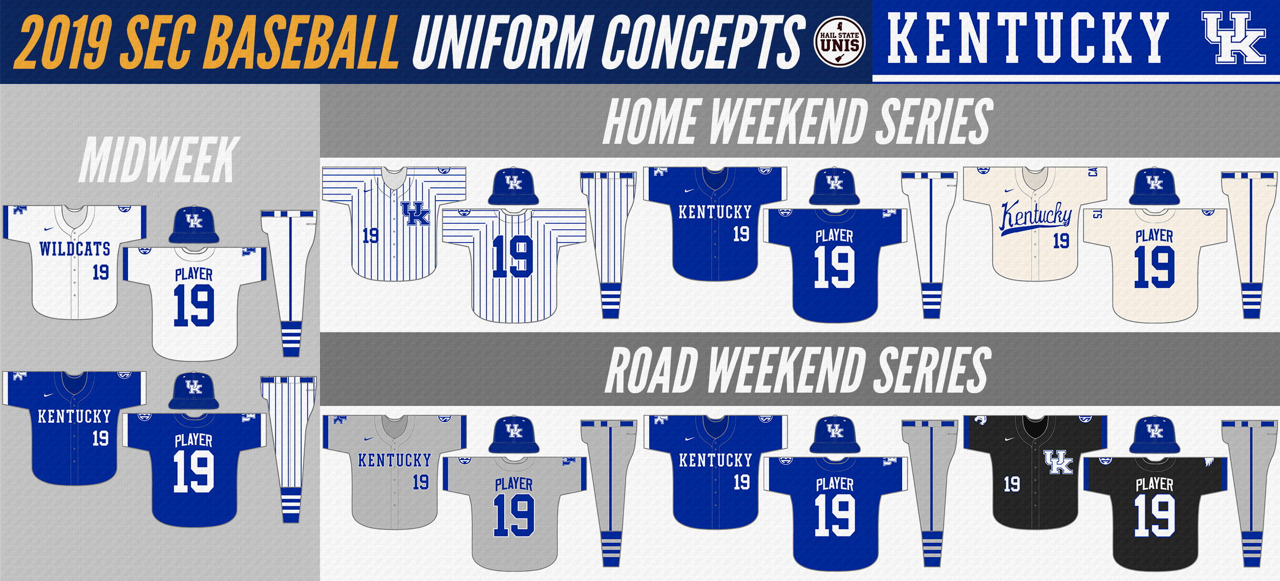
| Kentucky Wildcats Kentucky has a very underrated base set of baseball uniforms; they wear black too much, but their pinstripe, cream, and blue uniforms are some of the best in the league. This concept retains those classic looks, while bringing the gray jerseys in line with the rest of the set and replacing black with the dark gray color that Kentucky currently uses an as alternate in football. |
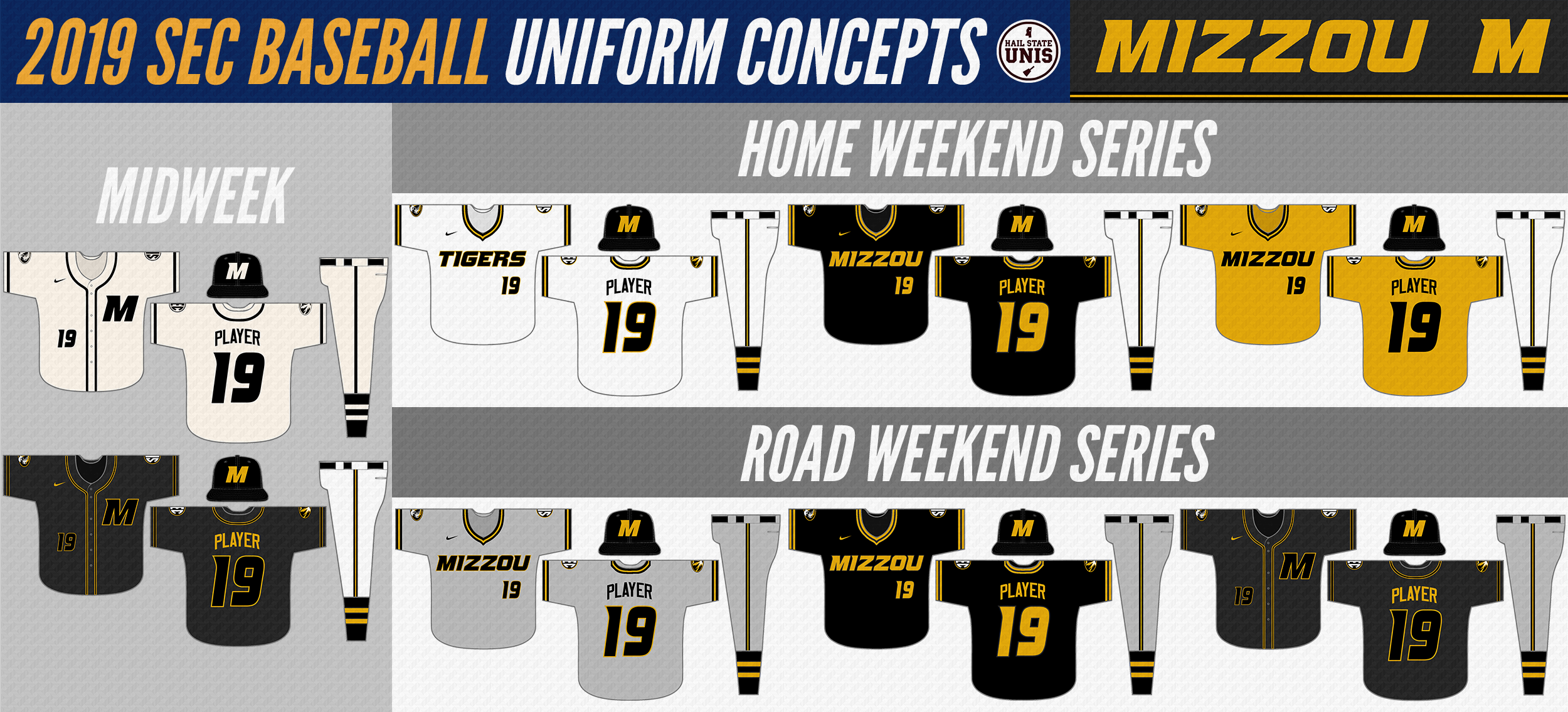
| Missouri Tigers Taking inspiration from their recent basketball uniform re-design, I saw Missouri as a team that could look good with a 80s-style pullover design. So, a pullover design with striped collars and sleeves is used for the white, gray, black, and gold jerseys. I also included cream and anthracite jerseys with a button-up design and the "M" logo on the chest to give Missouri a consistent, yet diverse, uniform lineup. |
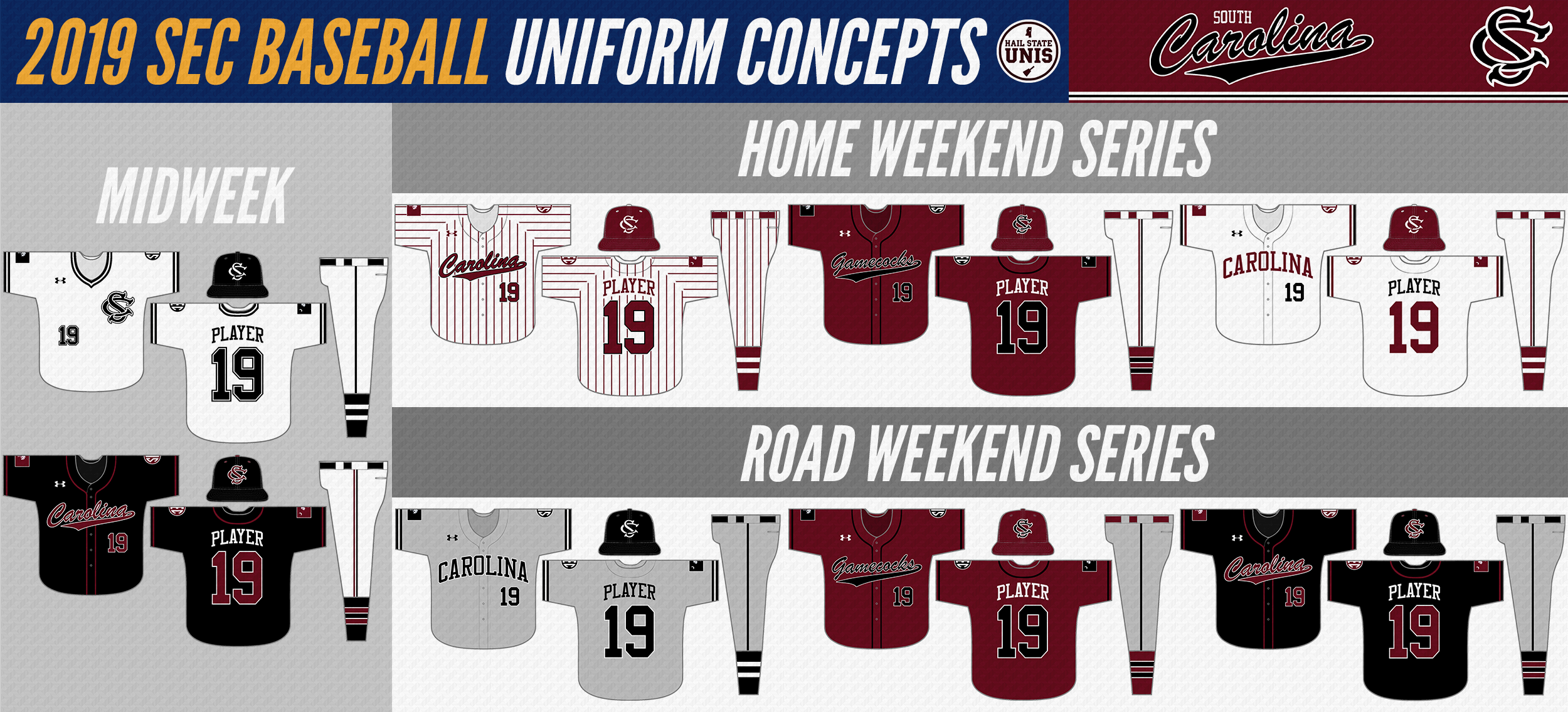
| South Carolina Gamecocks Every time I've done an SEC baseball concept series, I've always struggled with what to do with South Carolina. Obviously you have to keep the white pinstripes that they won back-to-back NCs in, as well as the gray and black White-Sox esque road jerseys that they wore during and since those runs. In addition to those, I kept a single garnet jersey and a single black jersey. I added two white jerseys: a white and black pullover for midweek games and a home version of the road gray design that balances the use of black and garnet. The set has 4 hats, all of which are worn with 2 combinations each. |
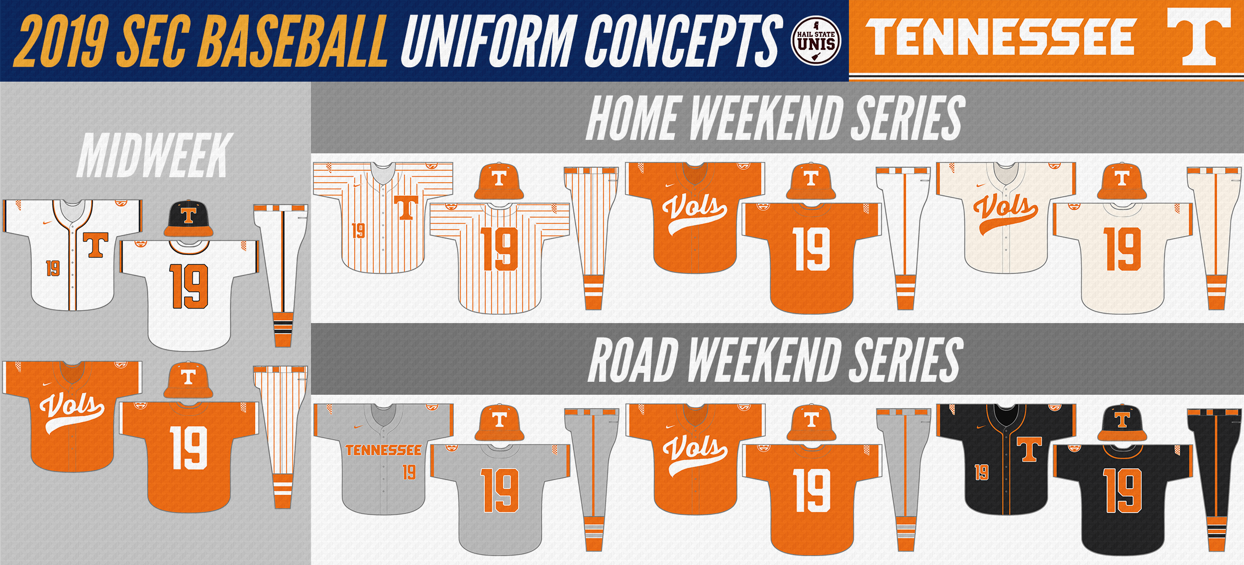
| Tennessee Volunteers Tennessee has the basis for a really good set with their orange and cream jerseys. This concept builds on those looks by removing all gray from the white pinstripes, giving them a more classic look, and adding a more traditional light gray road uniform. The orange and gray accented solid white jersey is retained for midweek games, and the all smokey gray look is retained for road game 3s, modified to feature the "T" on the chest. |
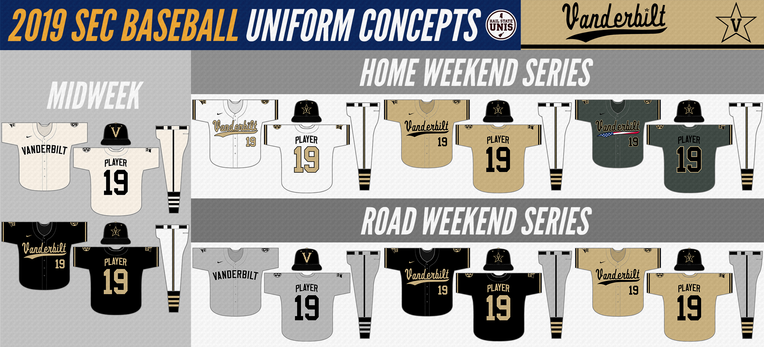
| Vanderbilt Commodores With Vanderbilt, I kept the script design on the white, gold, and black jerseys and removed all white from the gold and black jerseys. I retained the road gray design, and modified the cream jerseys to become a "home" version of it. For home Sundays, I kept the 2019 military green design, but switched to white pants for a cleaner look. The biggest change for Vanderbilt is probably going to the "V-Star" hat logo full-time in place of the block V. The academic "V" is still used on the hats paired with the cream and gray uniforms. The black jerseys and pants with gold pinstripes were not retained. |
Links to my previous SEC Baseball Uniform Concepts:
2017 (SEC West Only)
2015 (Entire SEC + USM and Jackson State)
2014 (Entire SEC + random other NCAA teams)
2017 (SEC West Only)
2015 (Entire SEC + USM and Jackson State)
2014 (Entire SEC + random other NCAA teams)

 RSS Feed