It's time for Mississippi State to take back control of its Men's Basketball uniforms. Instead of standard, borderline generic Adidas designs, the Bulldogs should look back at their own history to devise a uniform set that both looks great and takes inspiration from the past. That's what this concept aims to do.
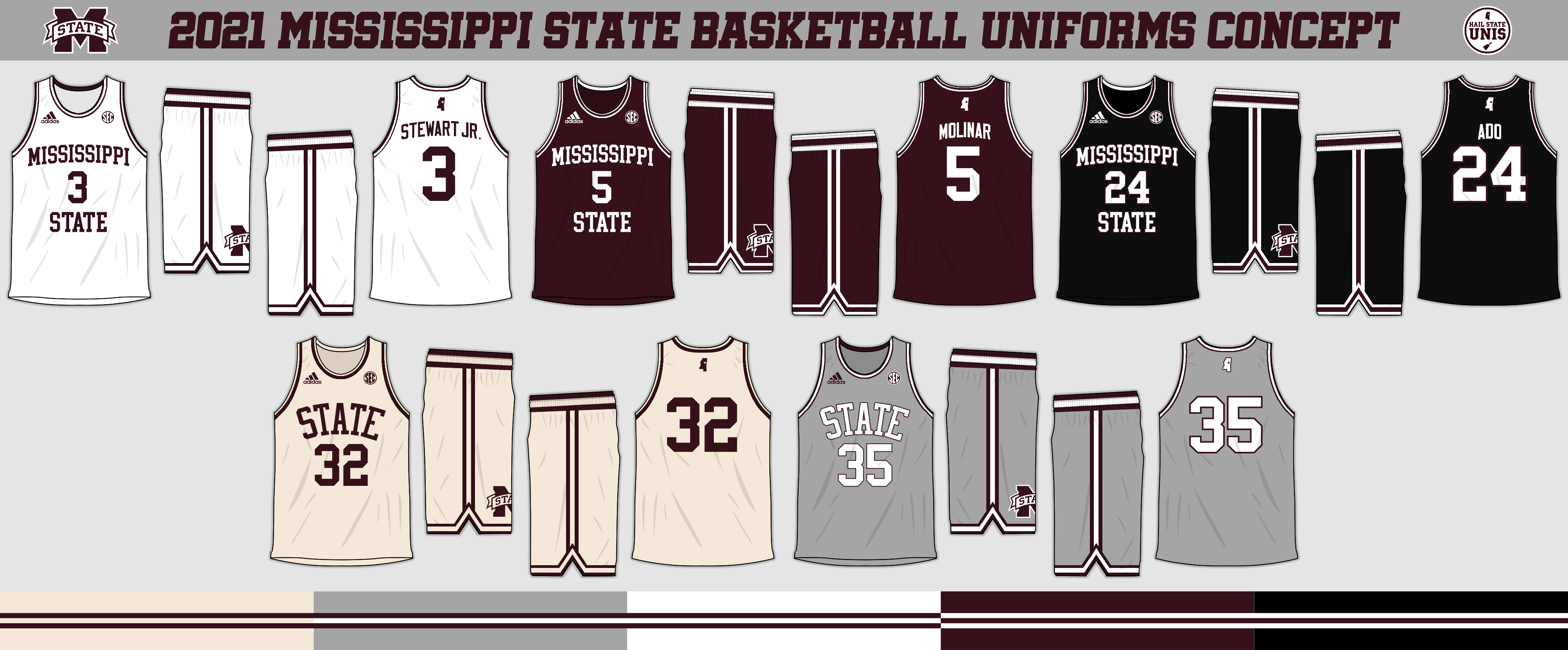
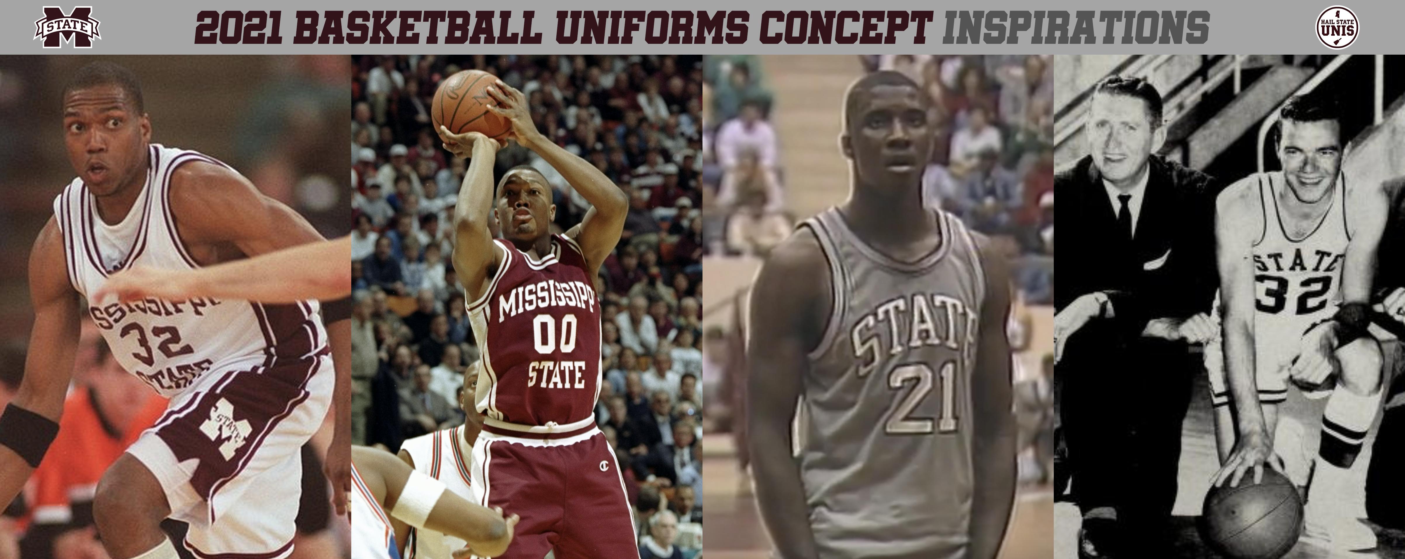
For the primary uniforms, we take inspiration from the 1996 Final Four uniforms, with "Mississippi State" spelled out on the front, with the player number in-between. Double stripes on the collar and shoulder loops are also taken from the 96 uniforms, and match the shorts design. The shorts design, which is the same for all five uniforms, mirror the cream throwback uniforms, with a classic double-stripe design on the waistband, sides, and bottom. This primary design is in white, maroon, and black.
The two other uniforms both simply feature "STATE" in block letters above the player number on the front and no player name on back. The first of these are the cream uniforms that have been worn each of the last five seasons; the other are gray uniforms with white accents, based on the ones worn in the late 80s.
With this set, you have a consistent design language, with a single shorts design, two different jersey designs, and five total color variations. The double-stripe idea makes this set consistent with the Bulldogs' current baseball uniforms, which also feature maroon/white/maroon stripes on gray and white and white/maroon/white stripes on maroon and black.
You would wear white as the primary home uniform, maroon as the primary road uniform, and black, gray, and cream as alternates. I would like to see the alternates worn 2 to 4 times each, with cream being worn only at home and gray/black being worn both at home and on the road.
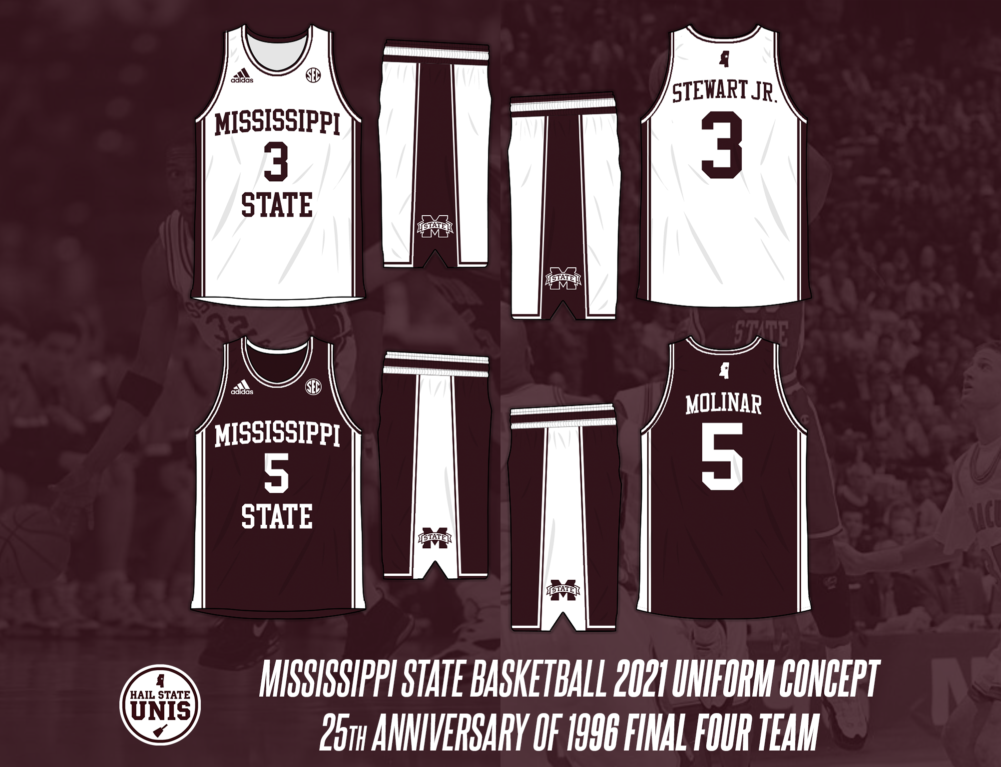
As an alternate idea, you *could* keep the current set but add straight-throwbacks to the 1996 uniforms. I tweeted out the below graphic a few months ago to much popularity. The 96 uniforms were some of the best in program history; they need to see the court in some fashion for next season's 25th anniversary.
 RSS Feed