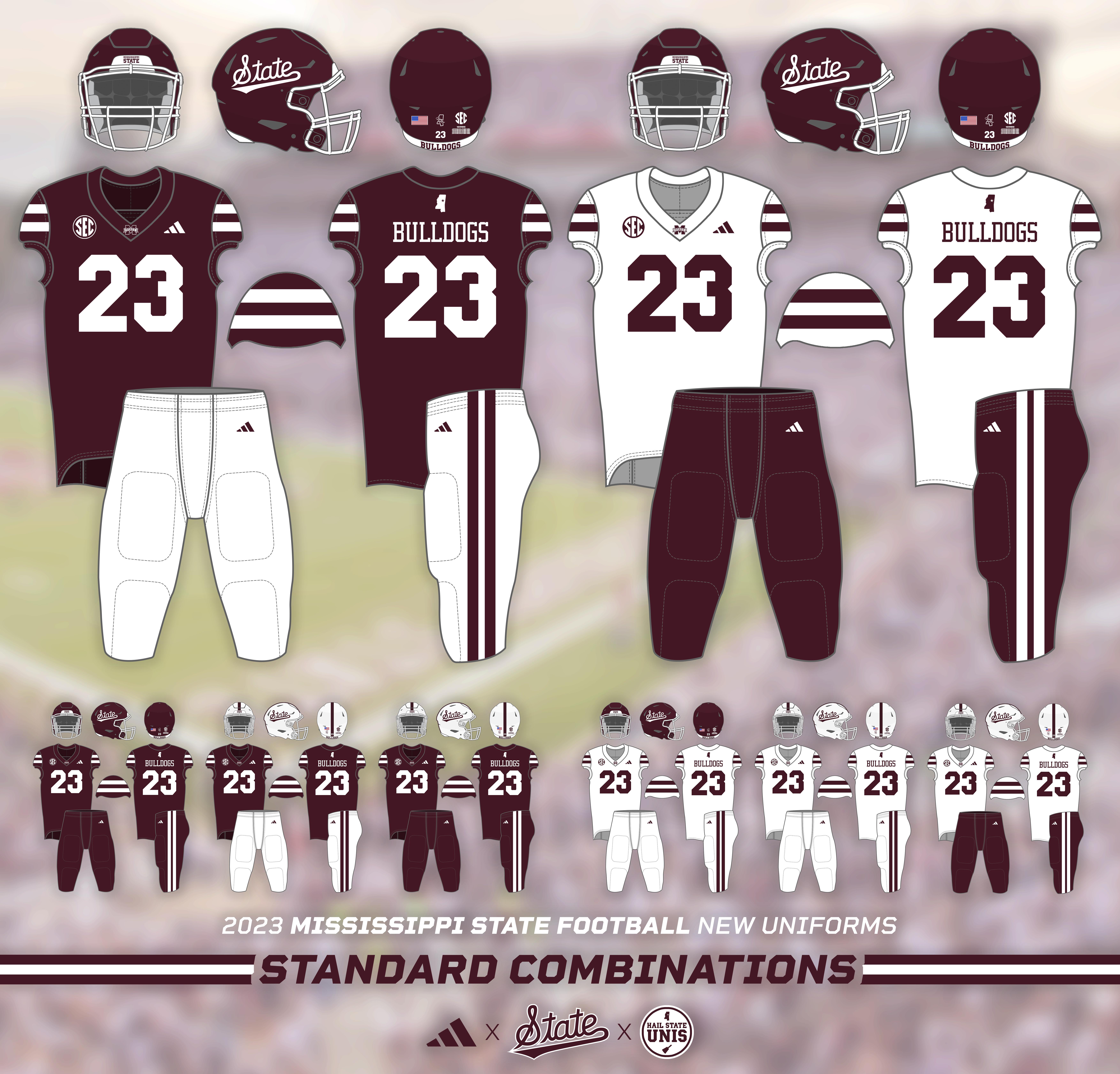
In July, Mississippi State unveiled a brand new football uniform set for the 2023 season! Featuring a simple, clean, and classic design, these uniforms have so far been a hit with fans.
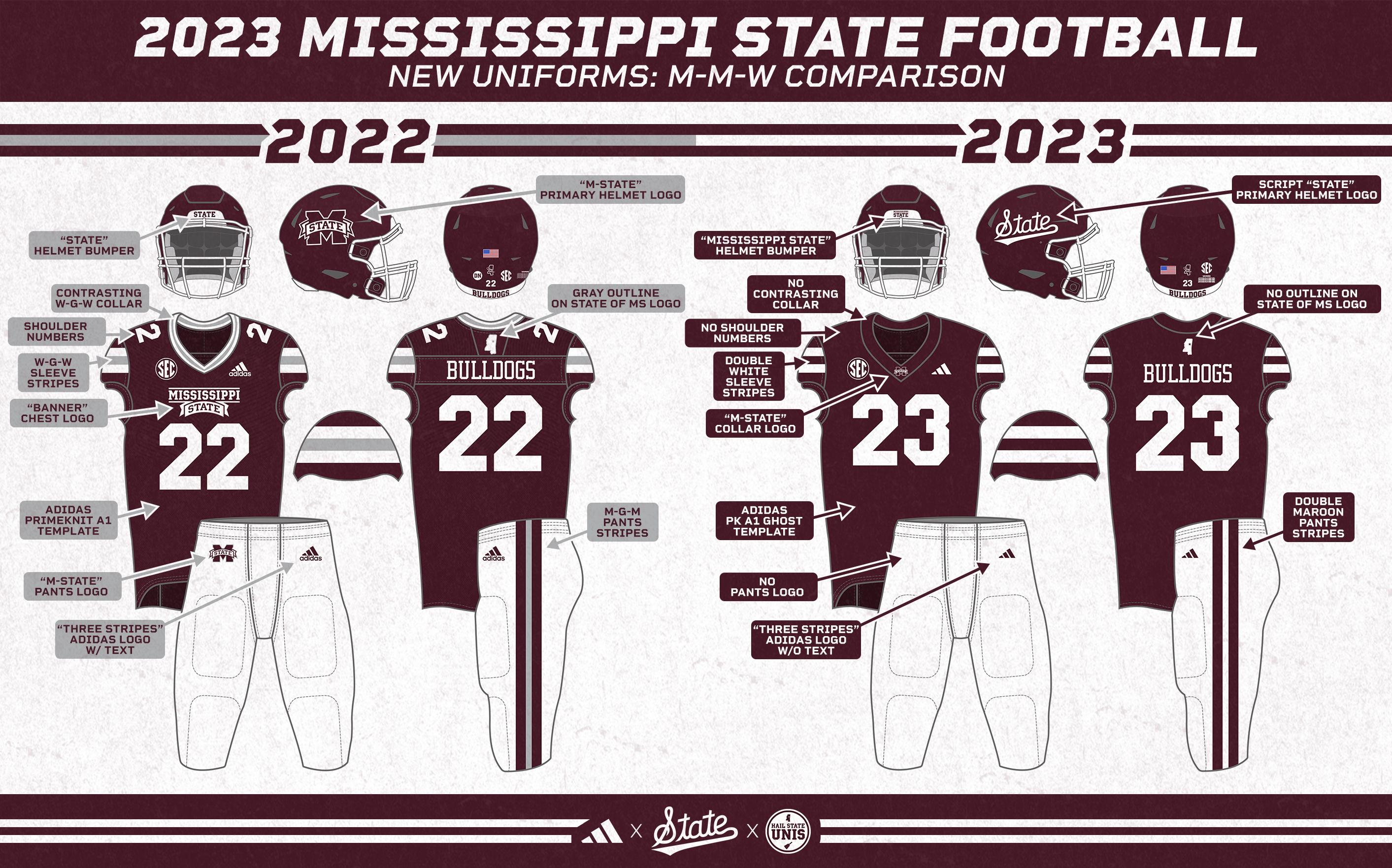
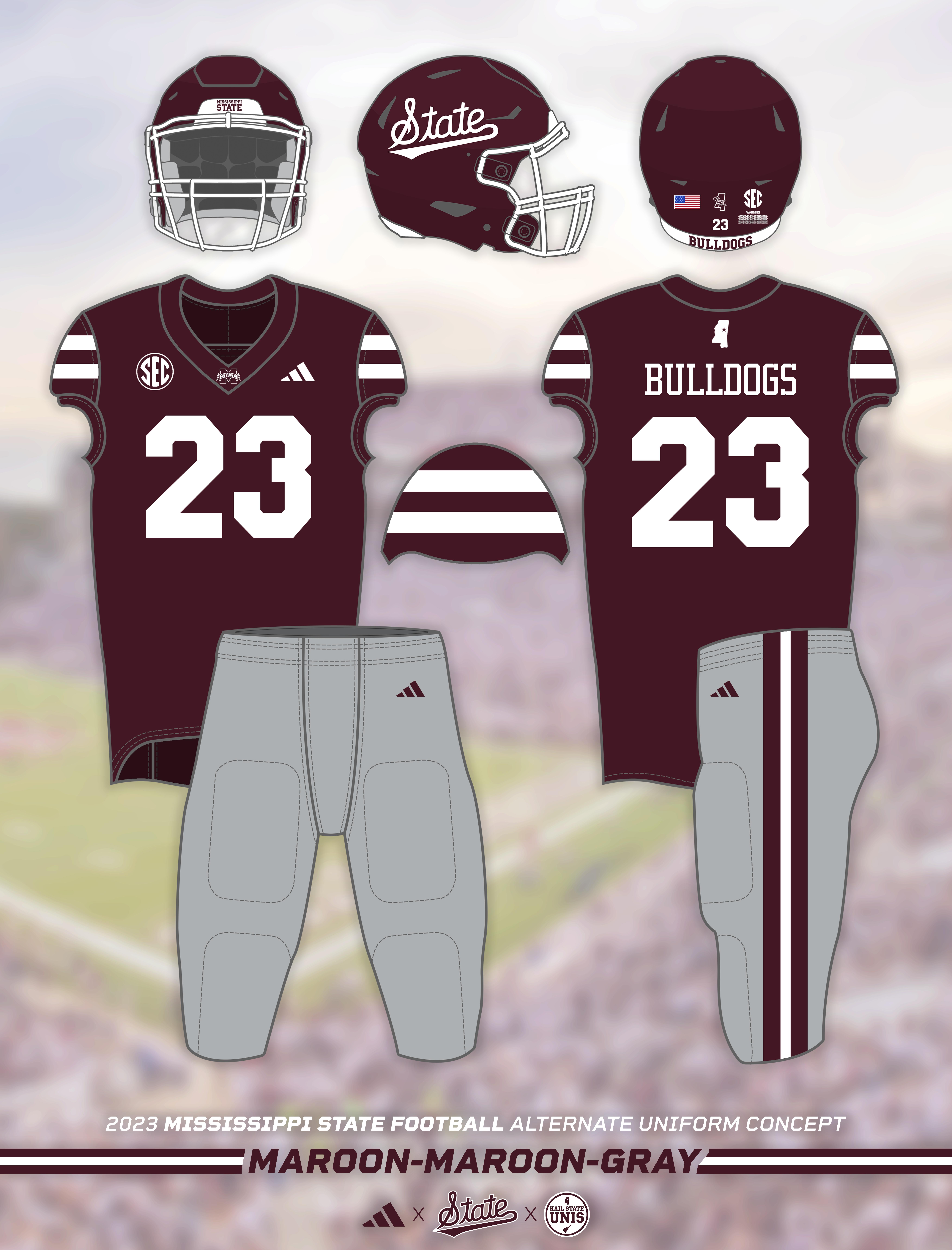
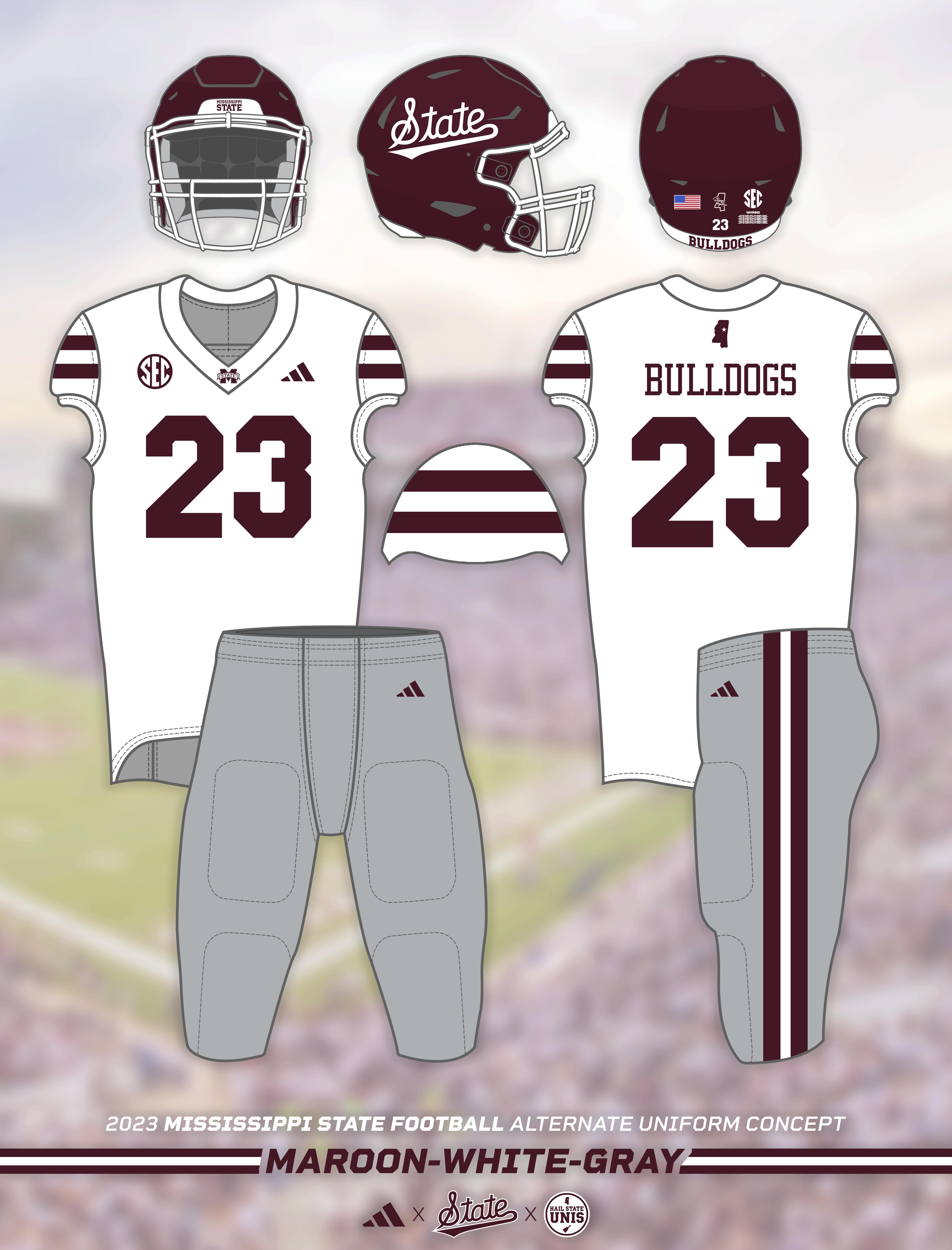
All gray accents were removed from the uniforms, with simple maroon and white double stripes (matching the aesthetic established by Mississippi State's baseball uniforms) now adorning the jersey sleeves and pants legs. The "banner" wordmark was removed from the front of the jersey, replaced by a small "M-State" logo on the collar. The pants no longer feature a logo. The uniform is on Adidas's newest template, the "Primeknit A1 Ghost", which features Adidas's refreshed logo that only includes the "three stripes" and omits the "adidas" lettering.
The most significant change this uniform set brings is to the helmets. The super popular Script "State" logo made its debut as an alternate helmet design last season and is set to take over as the Bulldogs' primary helmet logo for the 2023 season. This ends a 19-year run of some version of "M-State" logo being on State's primary helmets.
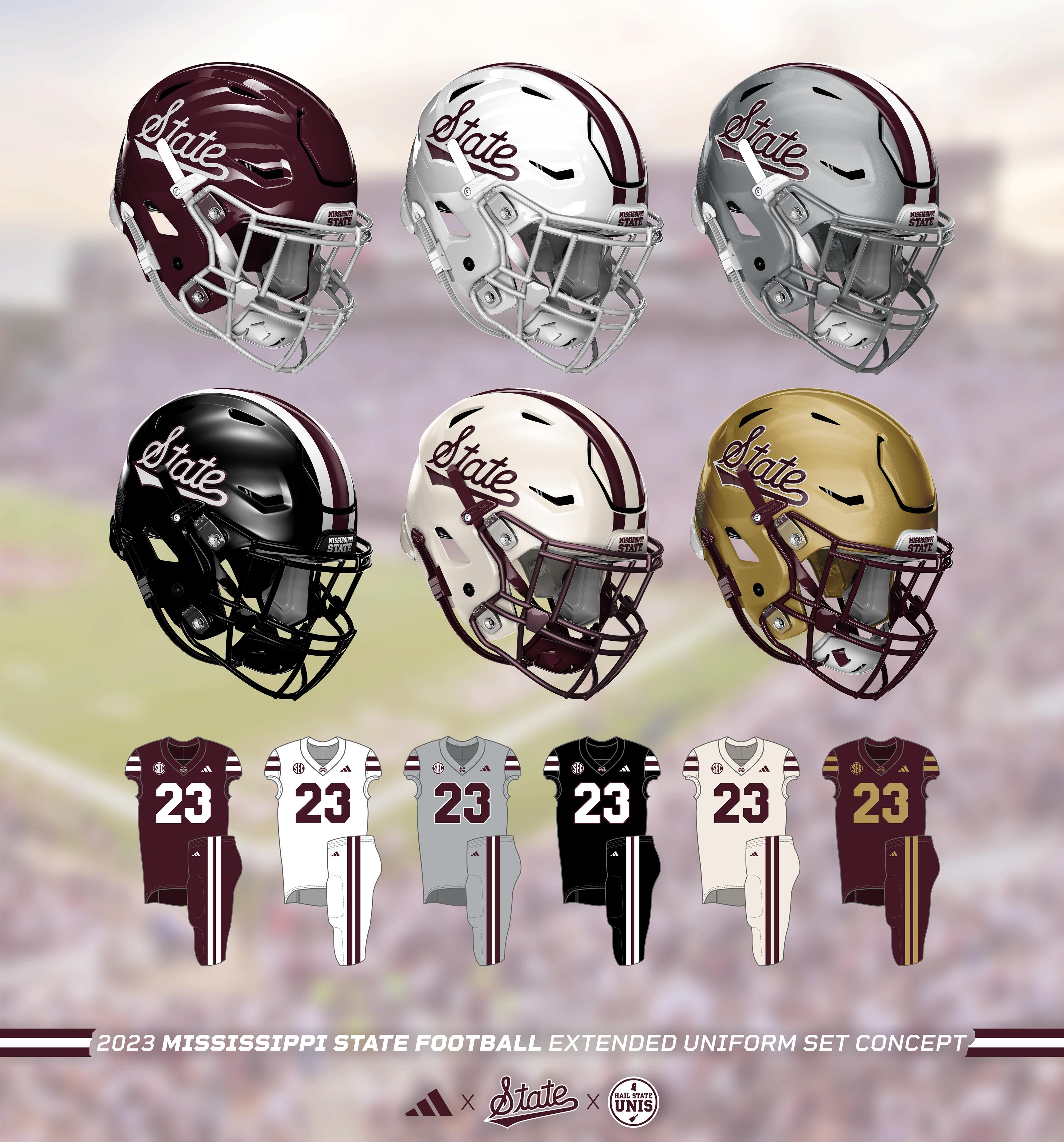
With the Script "State" on the helmets and the simplified double stripe look on the jerseys and pants, Mississippi State will have a great look as they take the field this fall to start the Zack Arnett era. As part of this concept series, I explore how this clean and classic style lends itself well to a variety of color schemes, allowing for several extremely sharp alternate looks in the coming years that can mix things up while maintaining a high level of consistency with the primary looks.
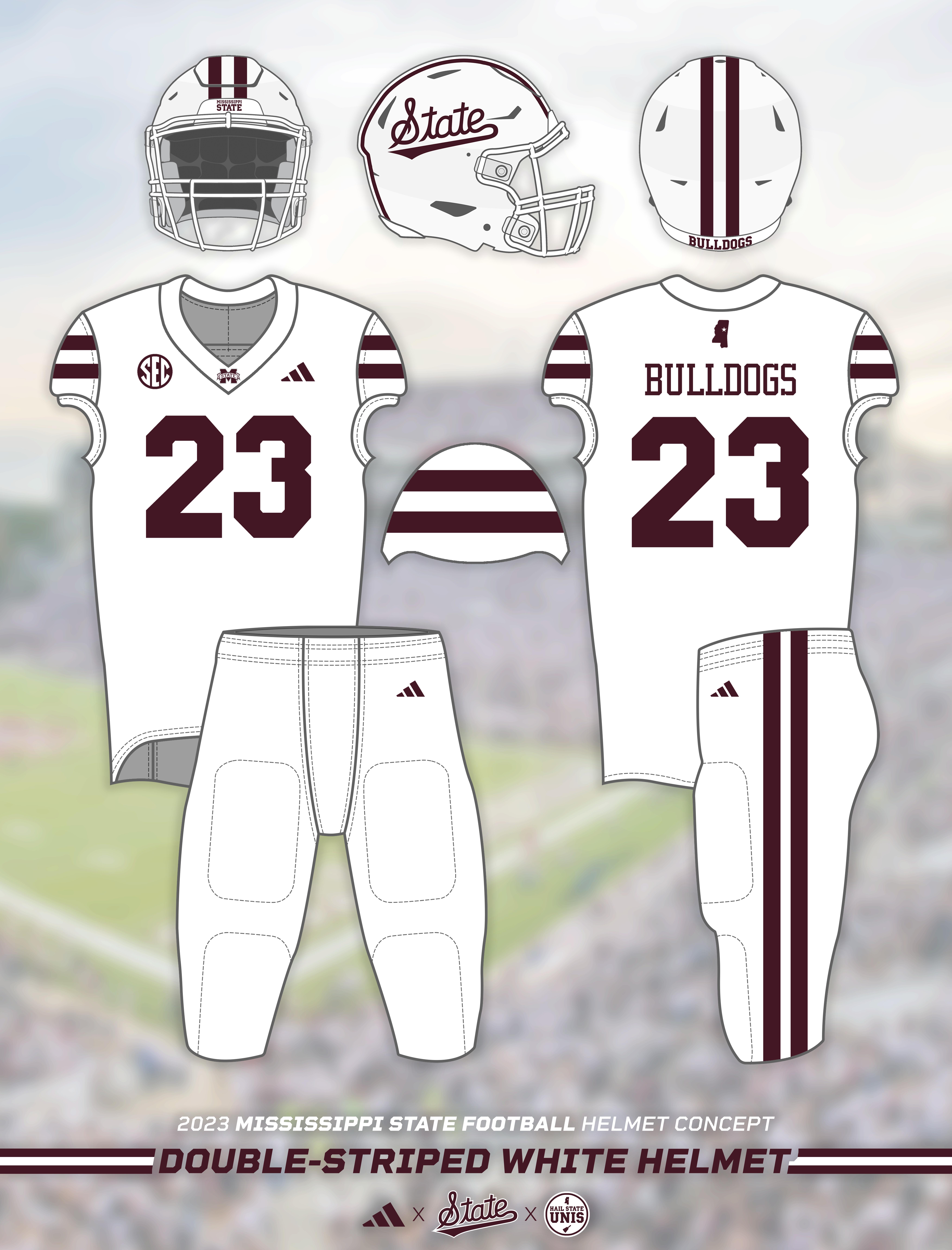
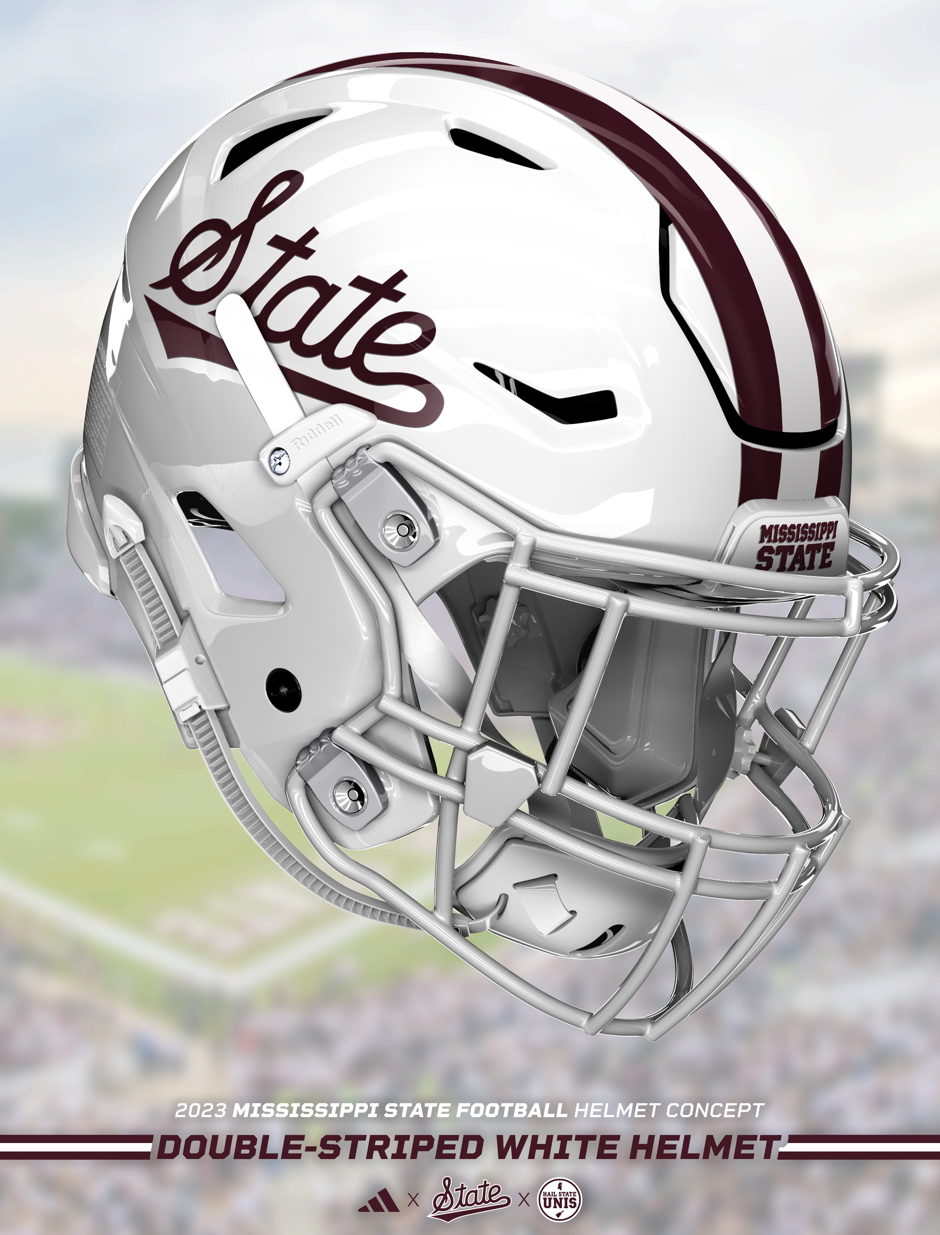
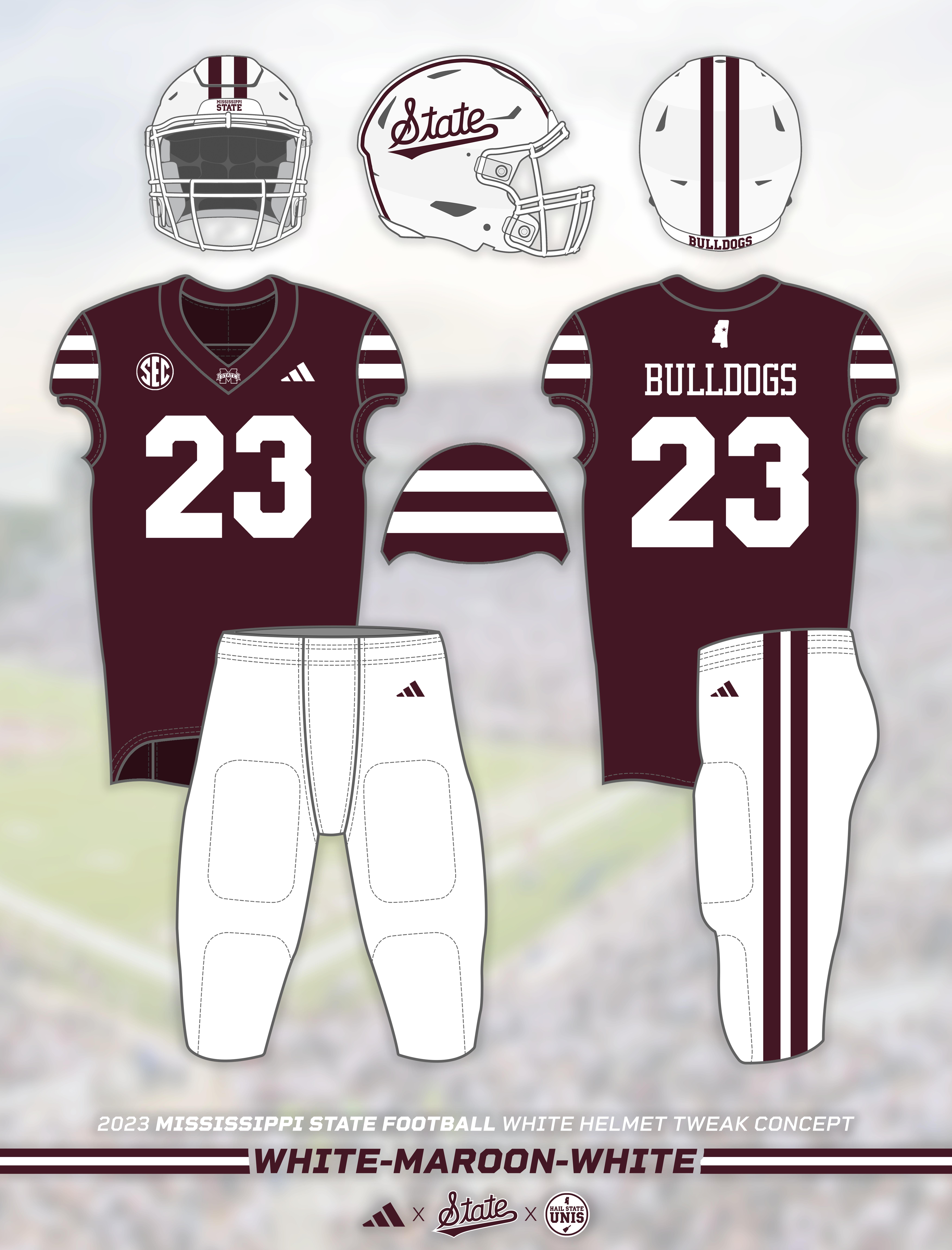
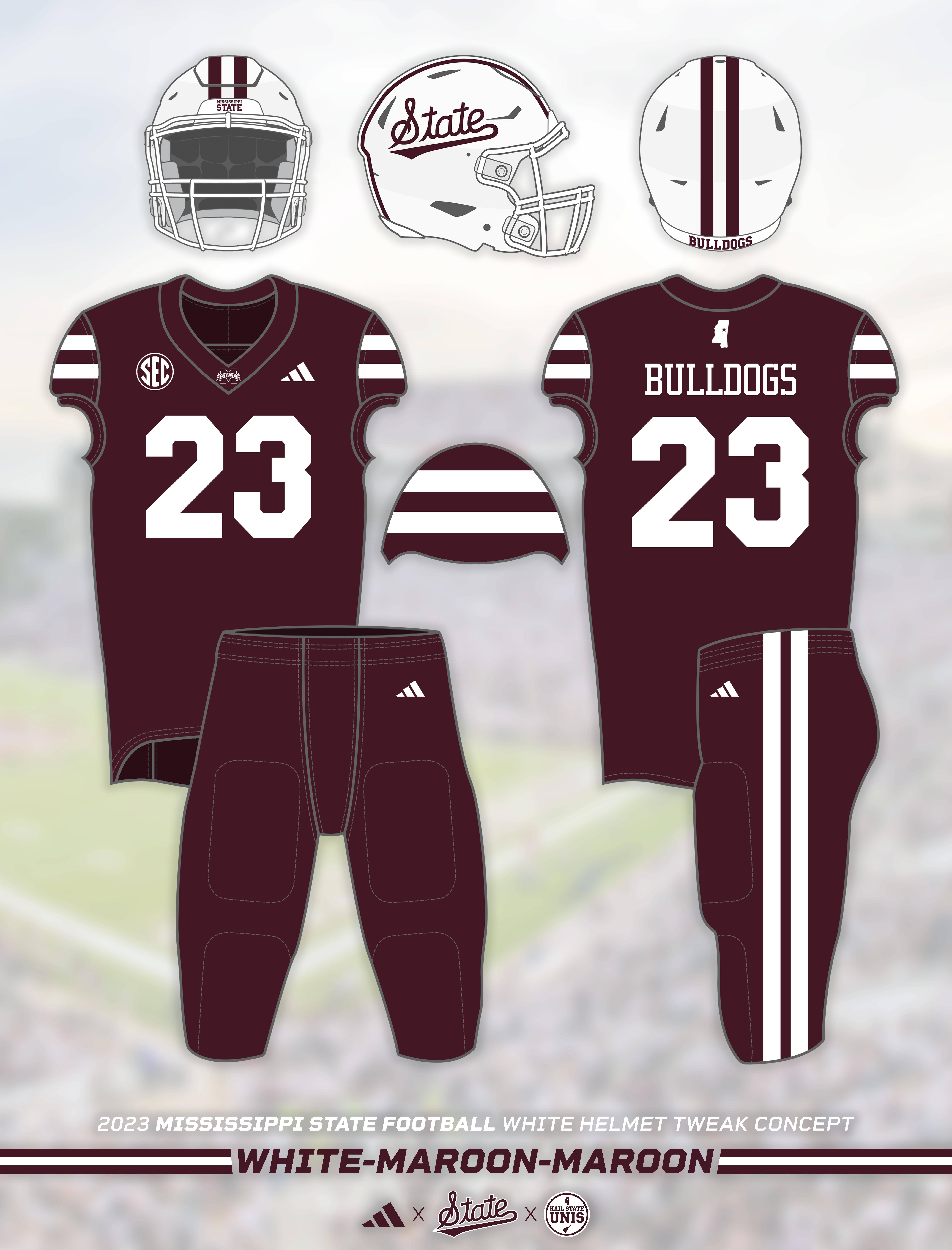
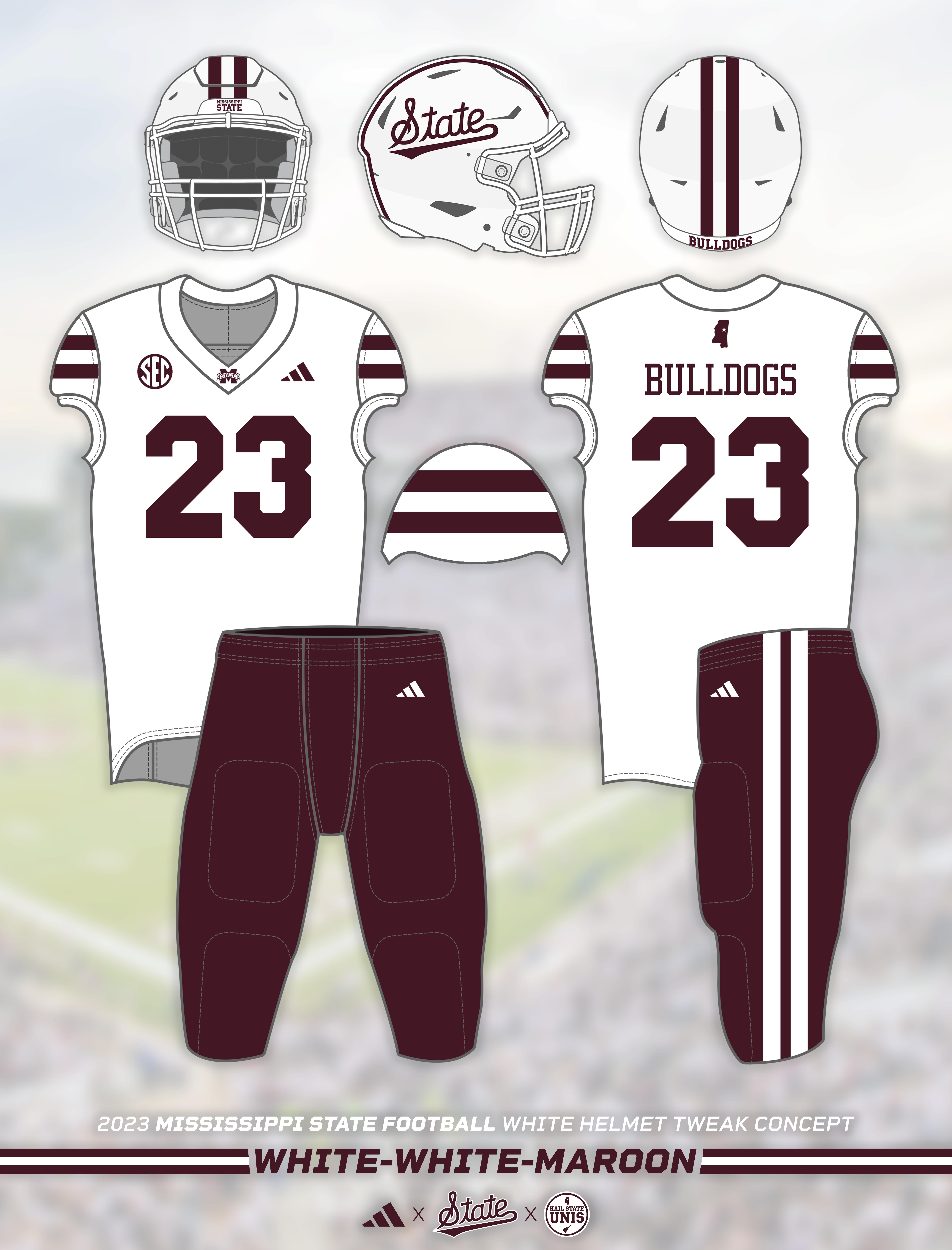
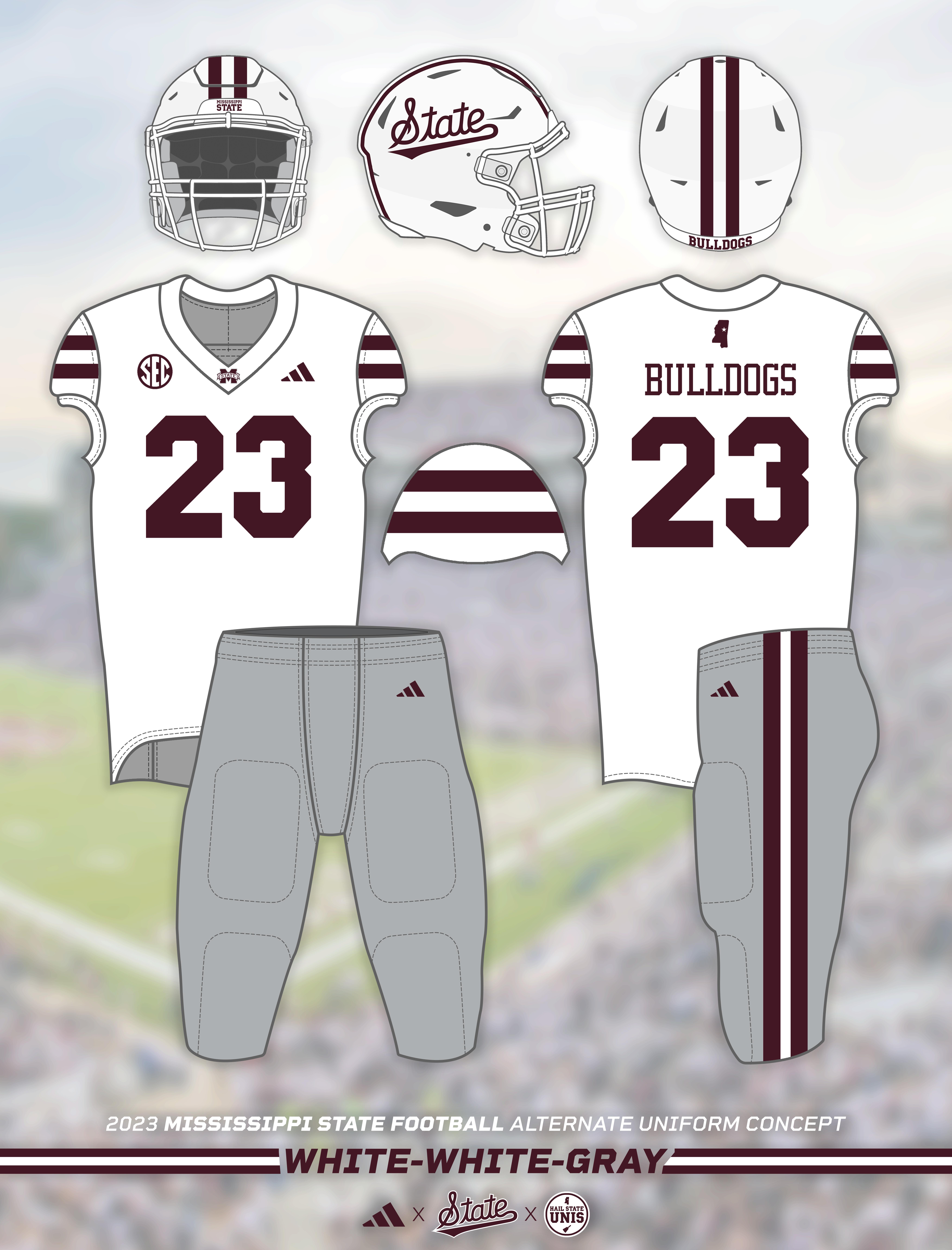
The first entry in this series is not actually an addition, but a tweak. Last season, Mississippi State debuted white helmets that featured a maroon script "State" logo, white facemasks, and a single maroon stripe. Presumably, that design will carry over to this season, with the script "State" now officially serving as the primary helmet logo.
However, with the new white jerseys and pants featuring double maroon stripes, I can't help but think that it would make the most sense for the helmets to feature double stripes as well. Shoutout to @AustinEast15 on Twitter (𝕏) for suggesting the idea and prompting this concept!
After seeing the mockups, I think it's clear that this is the direction Mississippi State should go with its white helmets. While other teams (the Colts, Ole Miss) have done single helmet stripes with double stripes on the jerseys and made it work, a double stripe would be much more consistent and would really complete the look.
The best part about this idea is that it's literally only changing a helmet stripe, meaning it absolutely could happen this season if those in charge want to make it happen. So there's actually a chance this becomes a reality and actually is Mississippi State's 2023 white helmet design. Let's start the campaign?
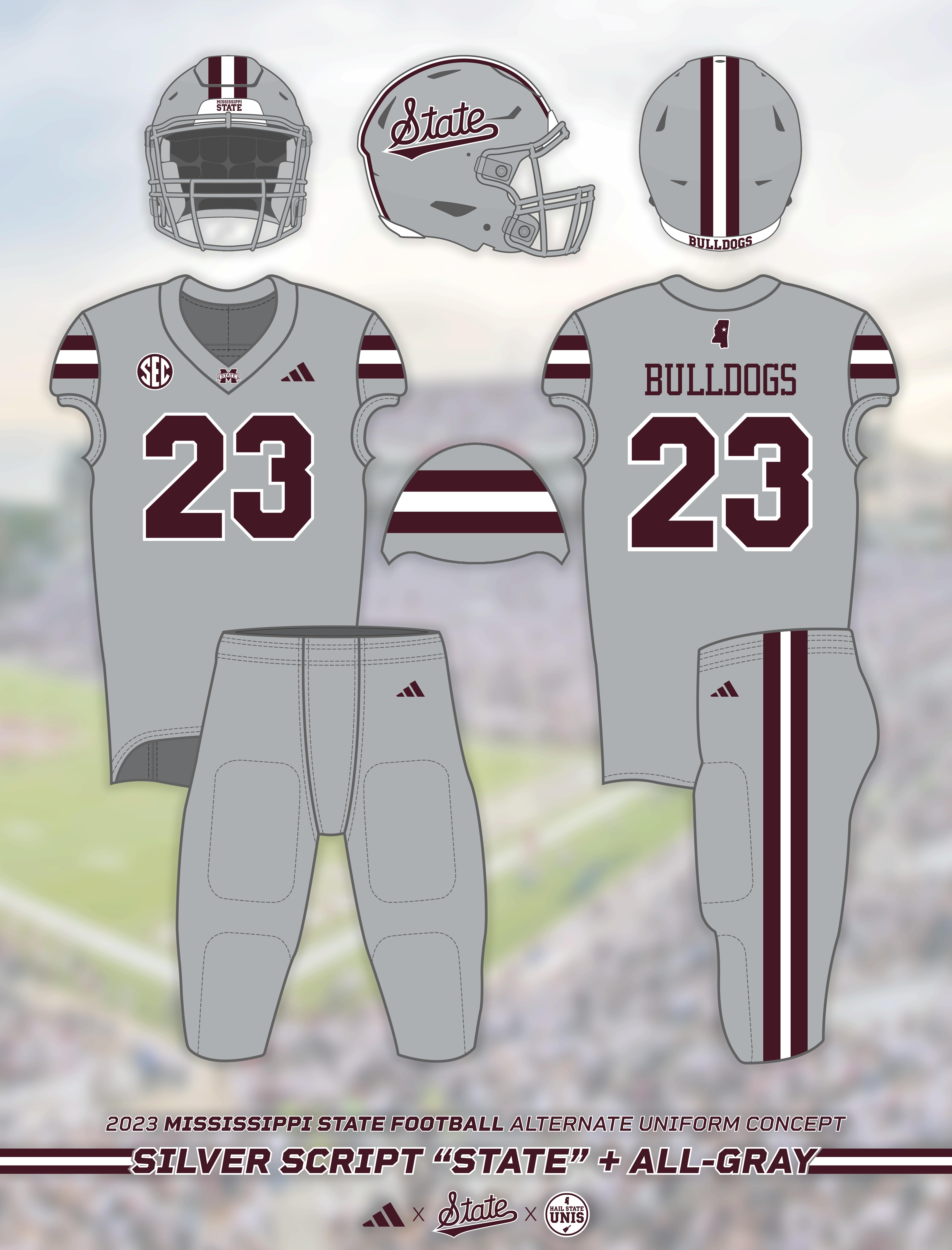
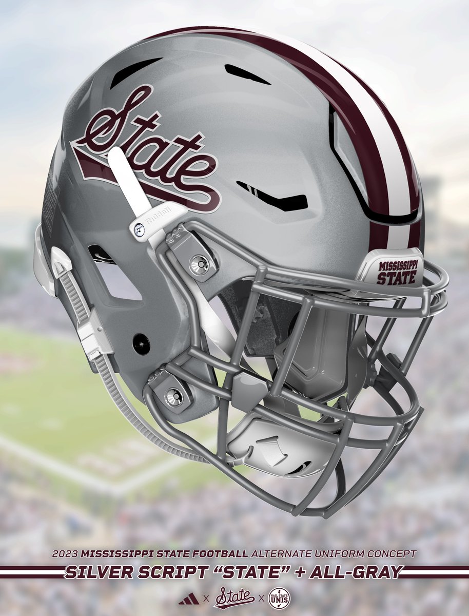
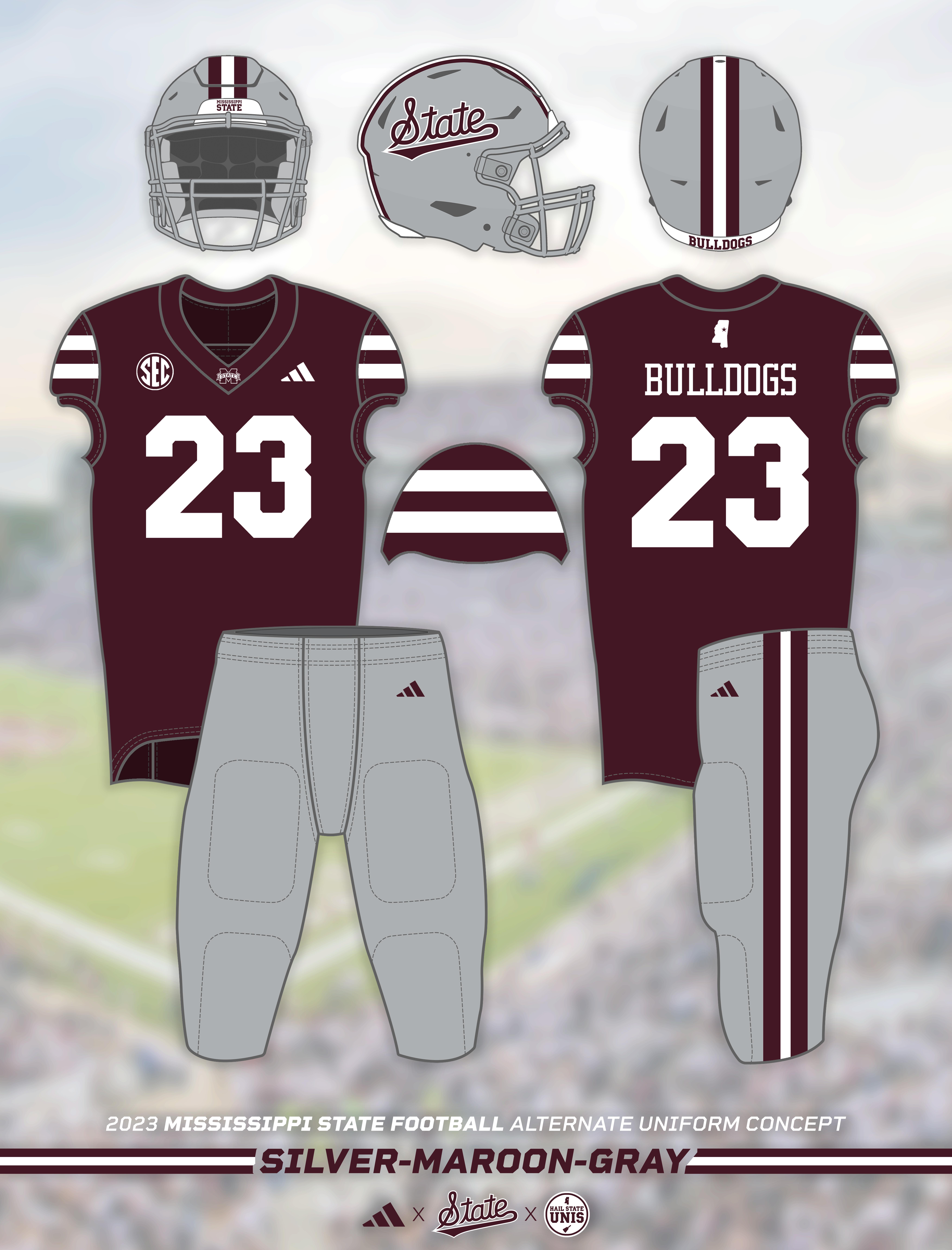
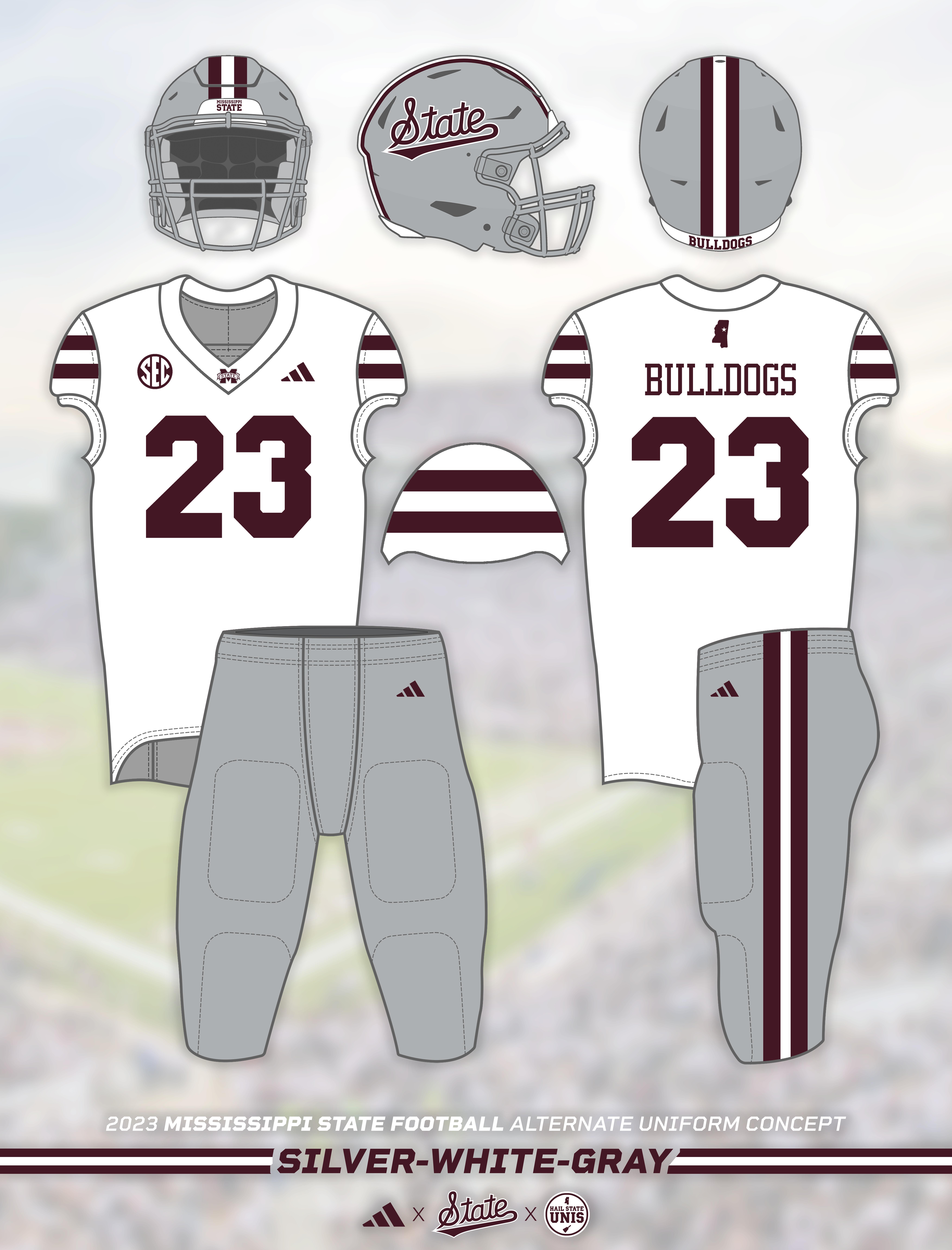
The first alternate in this series is an all-gray look, complete with new silver script "State" helmets!
Mississippi State previously wore silver helmets, which featured the "M-State" logo, no center stripe, and maroon facemasks, in 2016 and 2017. They wore alternate gray jerseys in both 2018 and 2021, though of varying shades and never in a design consistent with the primary set. The Bulldogs have worn gray pants with maroon-white-maroon stripes since 2015, and keeping those pants in the rotation is actually a big part of the motivation behind this idea.
Similar to the last idea, it actually is very possible that Mississippi State still has gray pants in its uniform rotation in 2023. No indication has been made either way, but Mississippi State finished the 2022 season with a perfect 5-0 record in gray pants, so keeping them around wouldn't be the craziest idea. Actually, the gray pants from last season could literally just be kept in the rotation. They technically would fit in with the current style just fine; if a new version was worn as is shown in this concept, the only differences would be removing the "M-State" logo and altering the Adidas logo.
Either way, I certainly hope that gray pants are still in the rotation in 2023; they've always been one of my favorite Mississippi State looks; the way that the gray color allows for both maroon and white to contrast and be used together is just *perfection*. For that reason, I think a gray jersey and silver helmet with a similar style could also look great. For this concept, I went more Cowboys style rather than Patriots style with the silver helmet, with a maroon Script "State" outlined in white and maroon-white-maroon stripes down the center to match the jerseys and pants.
The jerseys in this concept are simple re-colors of the primary maroon and white uniforms, with a gray base, maroon-white-maroon stripes on the sleeves, and maroon numbers outlined in white. The look as a whole was inspired by State's previous agray looks, Ohio State's 2023 all-gray look, and State's gray baseball uniforms that also feature the script "State".
I legitimately think this would be an excellent alternate look, likely for the 2024 season. We'll see if State actually has any interest in going this direction, but if they do, I think it's be a great route to take.
I love all of these looks. I'm all in for the return of silver helmets and gray pants whenever we feel the need to mix things up!
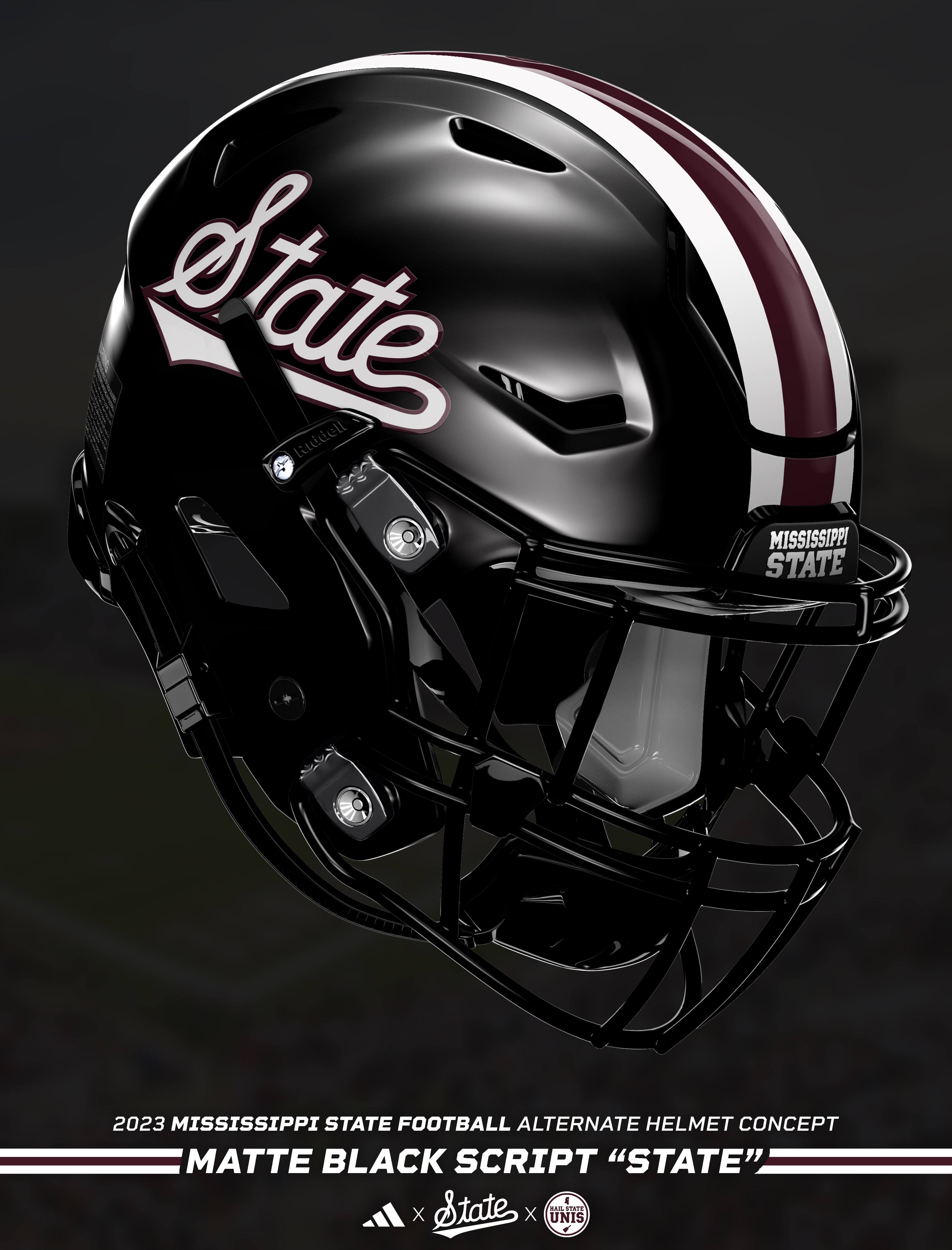
Any time you're talking about alternate uniforms, the idea of an all-black look will inevitably come up (shoutout to @big_furbs). Mississippi State has worn several black jersey and all-black looks throughout its history, most recently an all-black look that featured the first black helmets in program history in 2020.
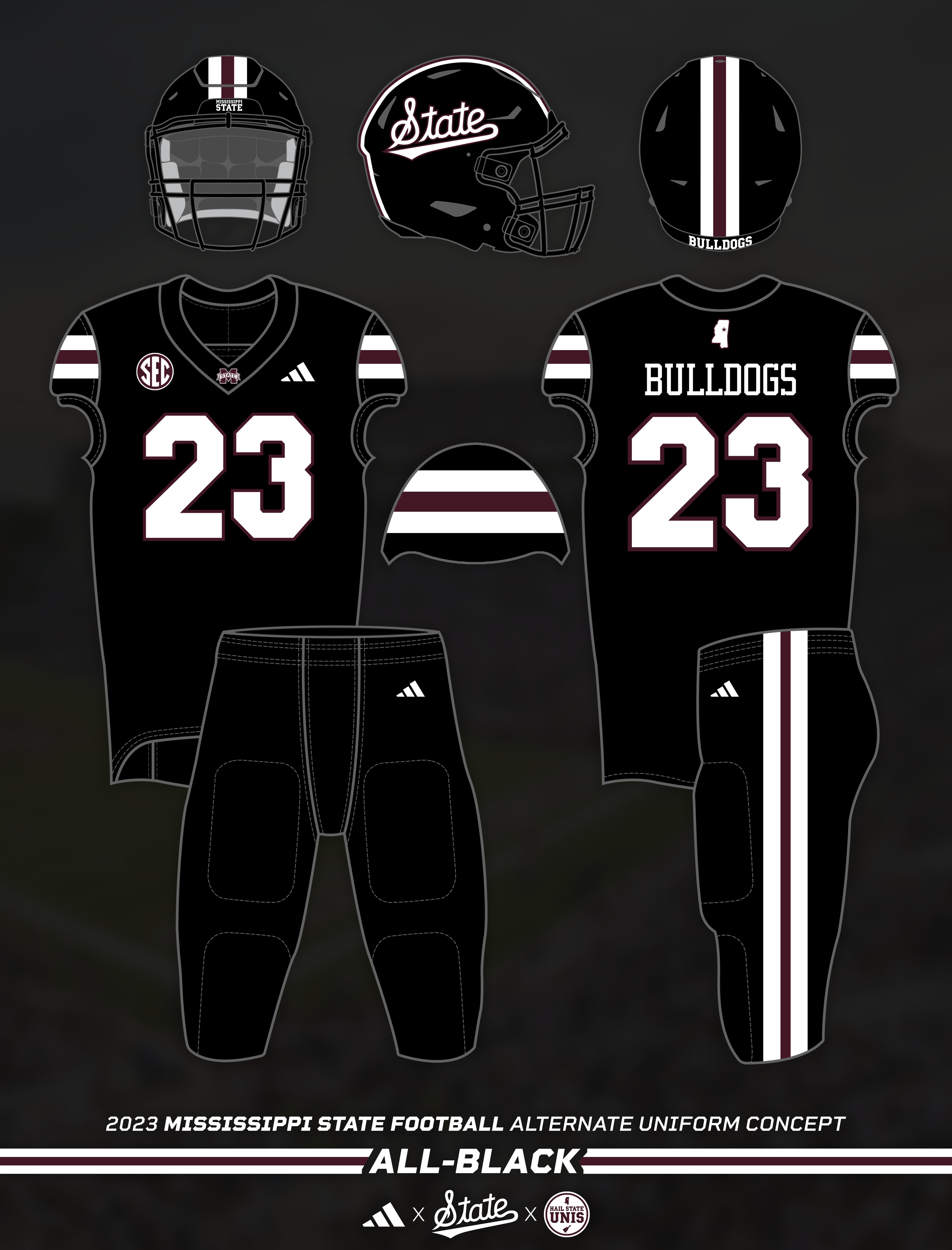
For this concept, I kept with the theme of a semi-traditional all black look that keeps to the design style established by the standard uniform set, simply recoloring everything. Taking a note from the popular "Nickelblack" uniforms that the baseball team wore from 2019 to 2021, the striping pattern used here on black is white-maroon-white. This stripe is featured on the helmets, jerseys, and pants, creating an extremely slick look across the board.
The helmets are matte black with a black facemask and the aforementioned white-maroon-white stripes down the center. To create maximum contrast, the script "State" logo on each side is white outlined in maroon. Similarly, the jerseys feature white numbers outlined in maroon.
I honestly surprised myself with how great these came out. I'm not always the biggest fan of all-black looks, but I think this one would actually be fantastic. Would be by far the best Mississippi State has ever worn, if I do say so myself. It accomplishes the goal of a clean, slick, and modern look while keeping consistency and brand recognition with State's new primary uniforms.
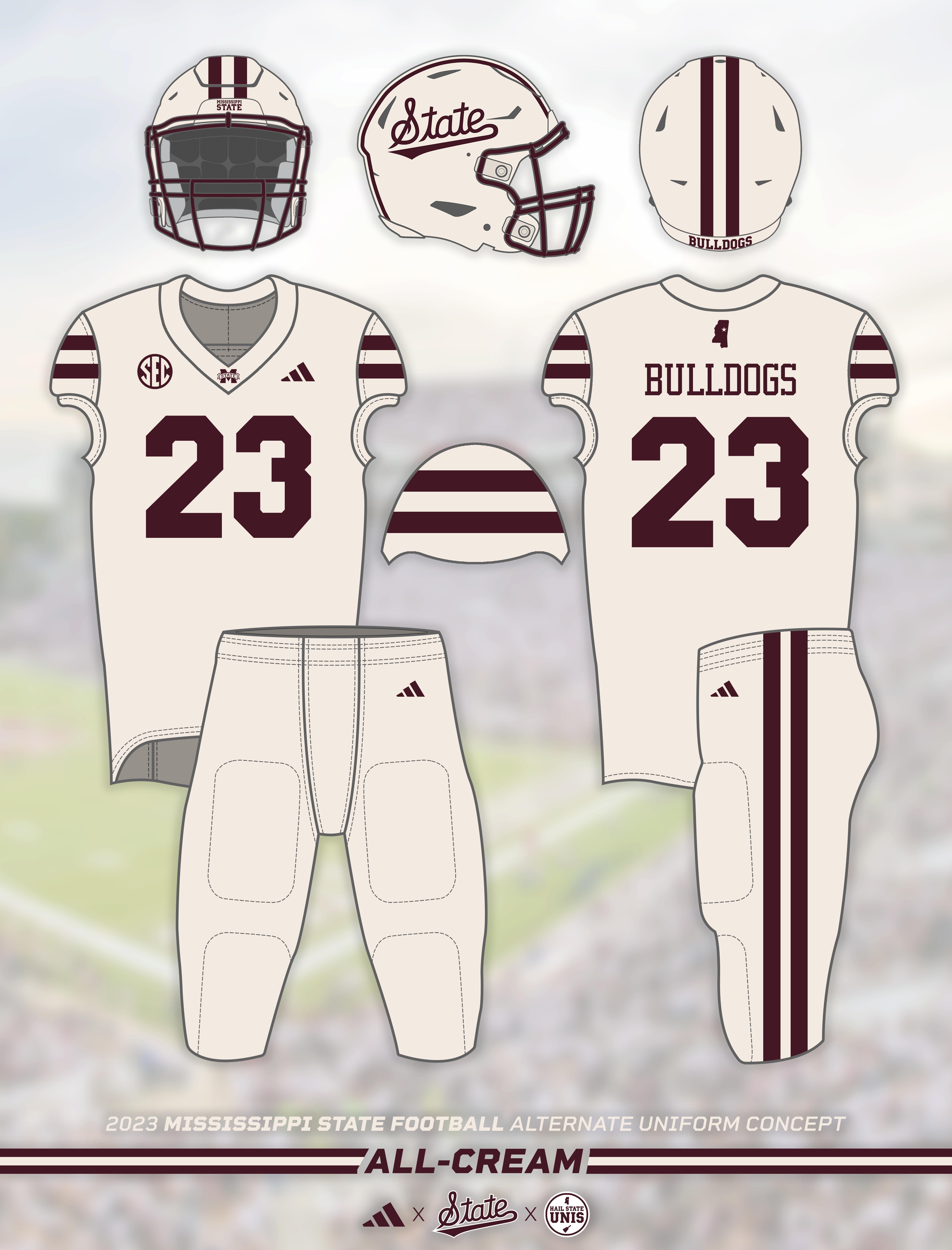
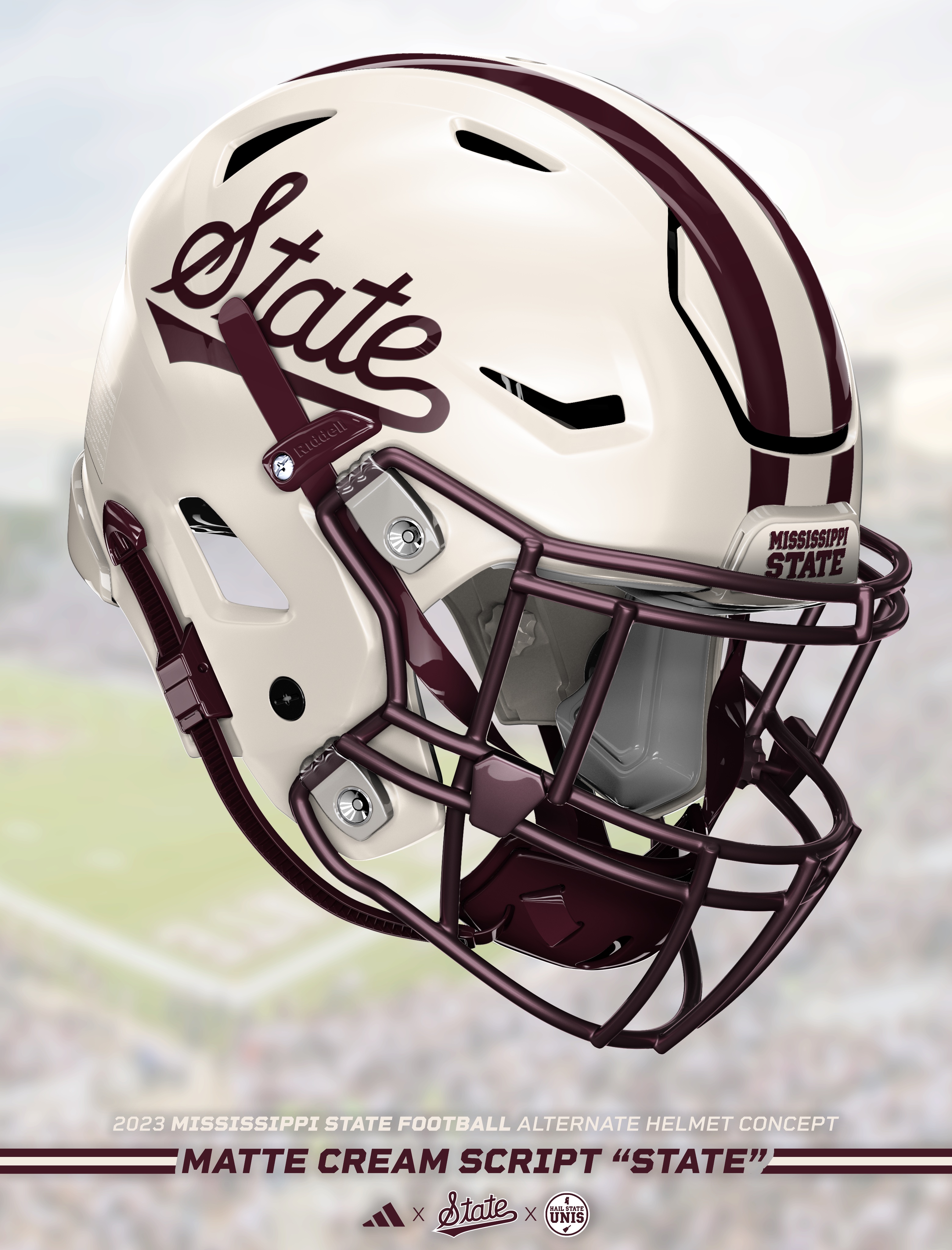
Mississippi State has worn cream uniforms in Men's Basketball, Women's Basketball, and Baseball, but never in Football. This idea (shoutout to @lathamlawsnance) explores what it would look like if State took a vintage-style approach to an alternate football uniform, and the result is incredibly clean.
The obvious drawback here is that it's arguably too close to all-white, but I think it's clean and distinct enough to stand out on its own. For the concept, I went with a matte cream helmet featuring a maroon script "State" logo, maroon facemask, and double maroon stripes. The jerseys and pants are simple re-coloring of the current white jerseys and pants, with all of the white replaced with cream.
I think this is a super cool look. Definitely gives off really cool vintage vibes. We already know from baseball that the script "State" works on cream so why not?
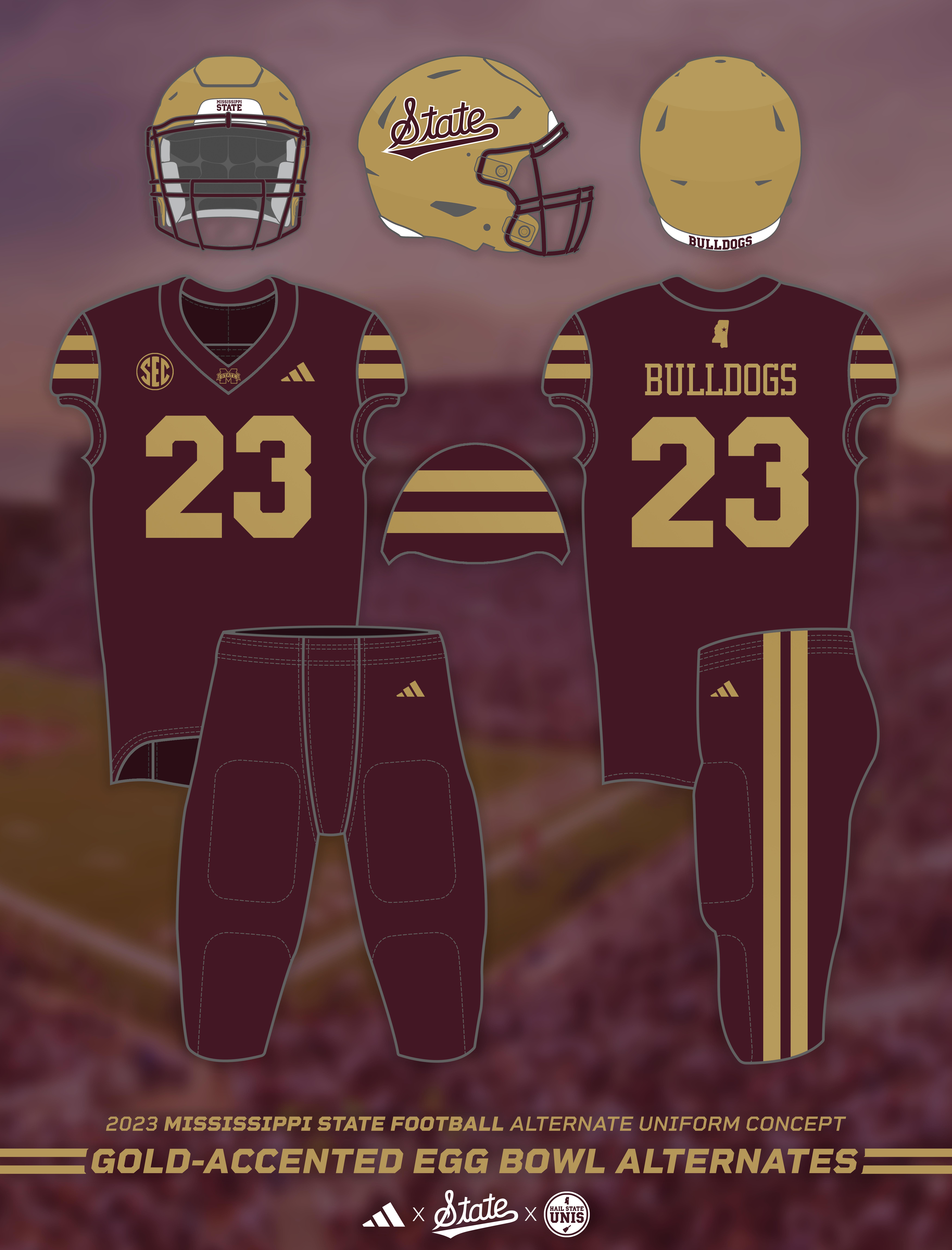
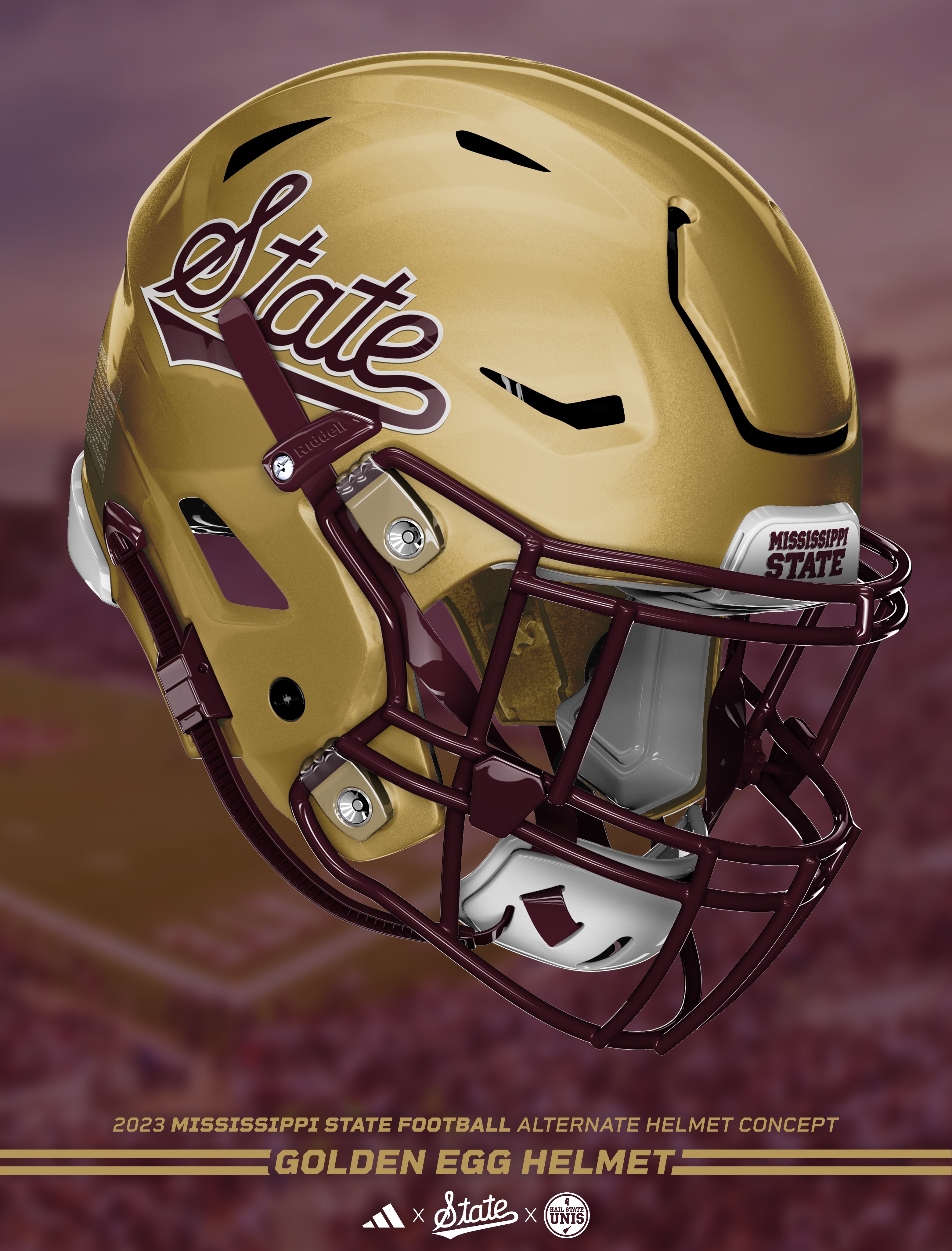
The final concept in this series is by far the most polarizing, at least judging by response on social media. As hard as it may be to believe, this fall marks the 10 year anniversary of the 2013 Egg Bowl, in which Dak Prescott and Mississippi State defeated Ole Miss in overtime wearing chrome gold helmets and all-maroon uniforms with gold accents. This concept explores what that uniform might look like as part of the current uniform set.
The jerseys and pants are a simple recolor of the existing maroon jerseys and pants, with all white replaced by gold. This gold would likely be a shiny material, similar to the ones worn in 2013 and 2019. For the helmets, I went pretty similar to 2013, with a gold base, maroon facemask, and a the script "State" logo outlined in white. Full disclosure, the 3d helmet template I was working with did not have a "chrome" layer, so I instead with with a metallic finish (similar to the 49ers's) that I think also works well. But for all intents and purposes, feel free to also imagine this concept with a chrome helmet that has the same finish that was worn in 2013.
The idea of a gold-accented alternate uniform for the Egg Bowl has long been a controversial one among Mississippi State fans. Despite losses in Oxford in 2012 and 2014 in gold-accented white uniforms, Mississippi State is 3-0 (2011, 2013, 2019) and has never lost when wearing gold-accented maroon uniforms. Furthermore, the Bulldogs are 0-3 (2015, 2017, 2021) in home Egg Bowls when not wearing gold since the concept was introduced. So if you're going purely based on stats, Mississippi State should always wear gold in home Egg Bowls and never wear it in road Egg Bowls.
Do I expect Mississippi State to wear gold-accented uniforms this season? No, I don't. I actually wouldn't be surprised if the late '90s "Interlocking" throwback uniforms are worn again for the Egg Bowl this season. Do I want to see gold-accented uniforms again? I go back and forth. They aren't the best look but we've undeniably done well in them. I do think they will be brought back at some point in the future, but I don't think it ever will or should be a consistent, yearly thing again.
Hail State!

 RSS Feed