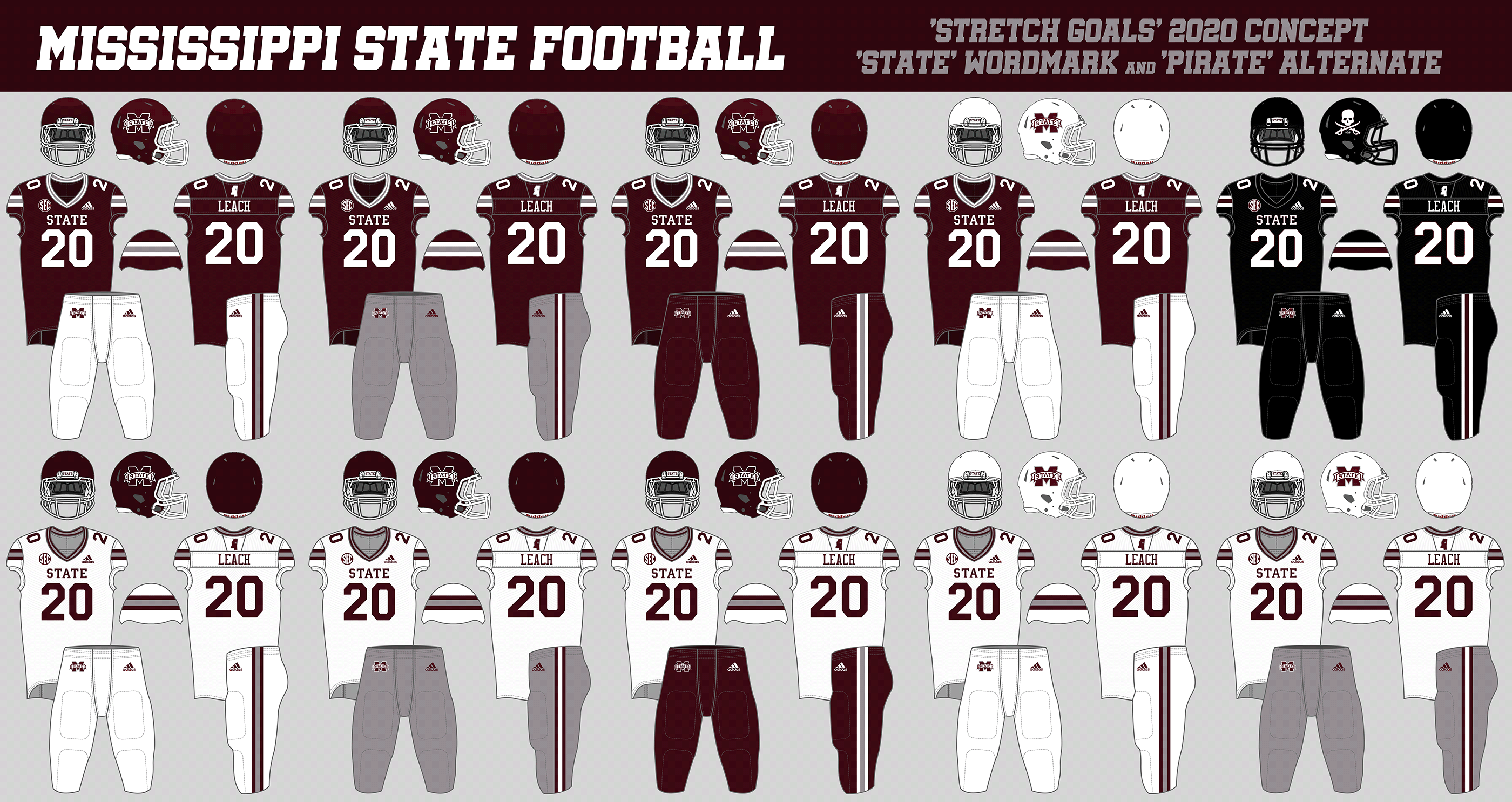
However, the were also a few more "stretch goals" that I mentioned that I think would improve the Bulldogs' uniform even more. These are changes that aren't necessary vital and could probably wait until the next template upgrade or manufacturer change.
The biggest one of these "stretch goals" is changing the center chest wordmark from the "Mississippi State" banner logo to a simpler "STATE." The 2018 "Statesman" uniforms were the first football uniforms in school history to simply featuring "STATE" across the chest, and those were some of the most well-received alternate uniforms in school history. This concept uses the "STATE" wordmark in (a slightly thinner than regular version of) Mississippi State's custom block font, and I think it works very well. I've seen a lot of fans express interest in going with a similar look, and I think it's something that Mississippi State and Adidas should strongly consider.
The other, smaller changes that are included in this concept:
- A darker maroon color for the jerseys: this is mainly a problem with the shimmer on the Primeknit A1 jerseys; the previous template didn't have this problem.
- Thinner numbers: the black alternates in 2019 used thinner numbers, and I thought it looked really good. Might be something to consider for a full-time change.
- More-even pants stripes: one of the better changes to come out of the switch to the Primeknit A1 template was that the pants stripes were thinned from their previous gigantic size to a more reasonable one. However, a side effect of that change was that the middle stripe is now thinner than the two outer stripes. For the next template change, I'd like to see the current total width stay the same, but for the stripes to be more even (i.e. each one 33% the width of the total)
- Consistency with the pants logos: following Mississippi State's recently updated brand standards, the M-State logo on the maroon pants should be maroon with a white outline (matching the shiny maroon helmet logo), rather than white with a gray outline as it currently is. Also, optionally, a white outline could be added to the M-State logo on the gray pants.
|
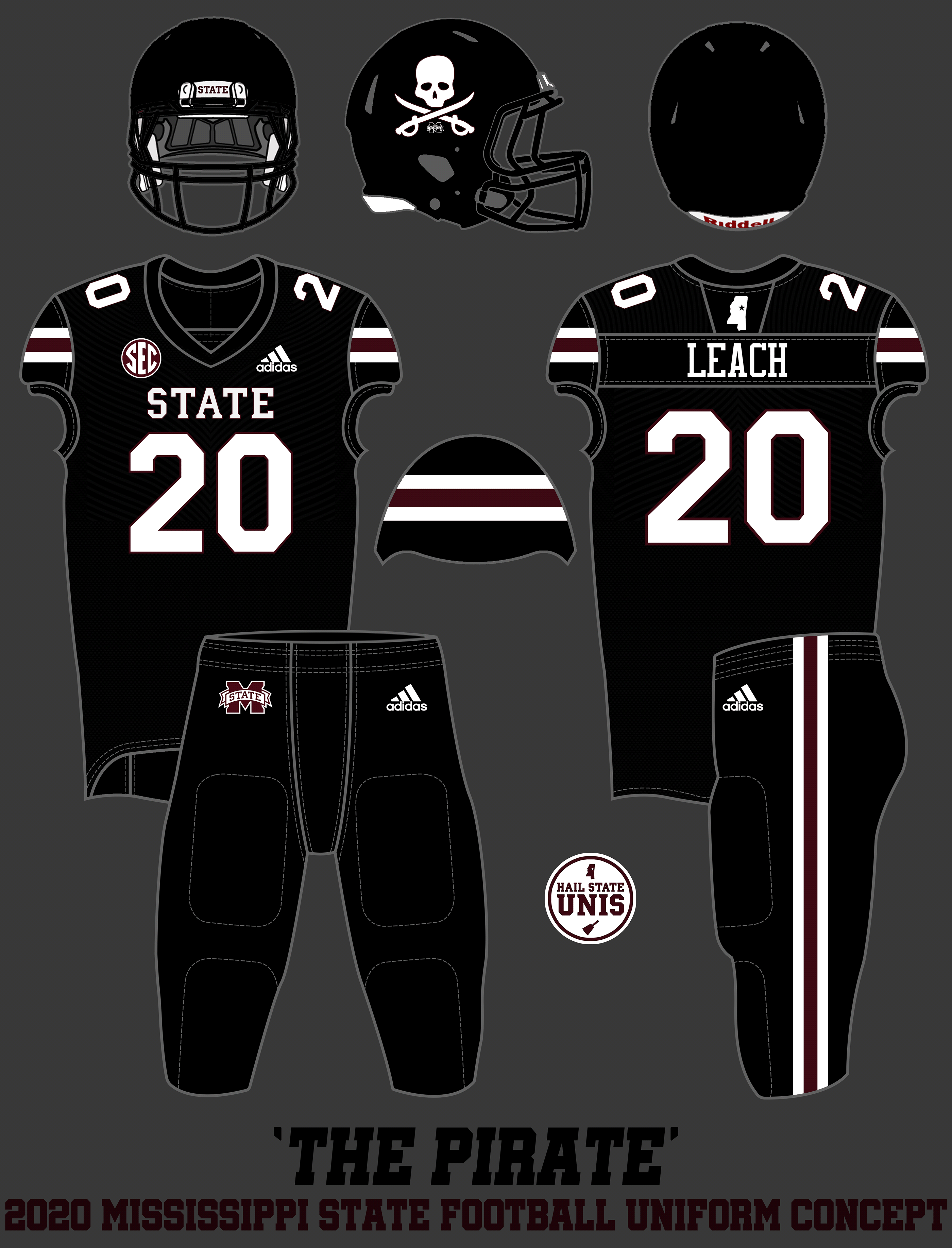
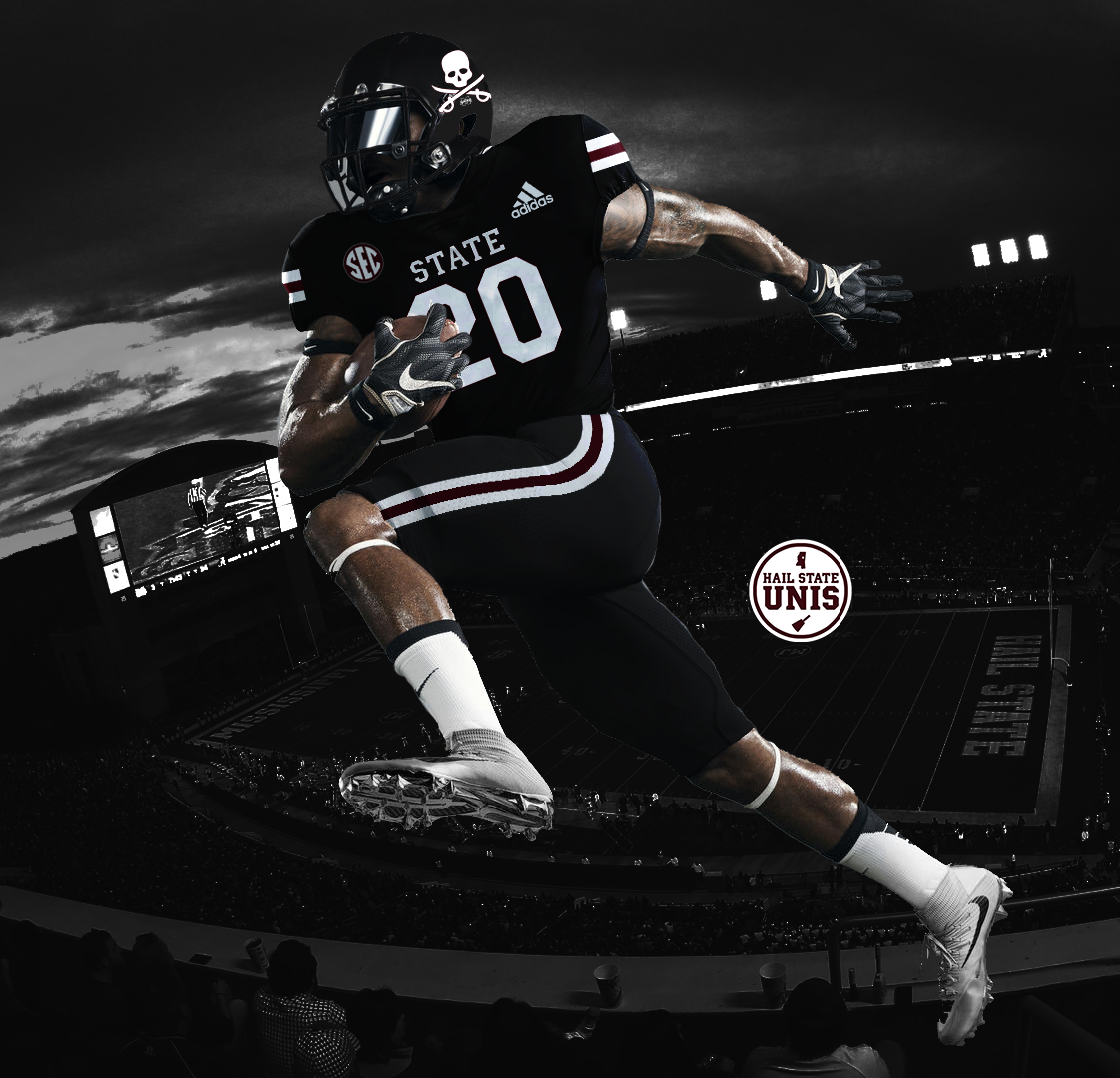
Finally, also included in this concept is an all-black alternate uniform with a pirate-themed helmet in honor of Mississippi State's new Head Coach, "The Pirate" Mike Leach. The uniform is consistent with the rest of the designs in this concept, with W/M/W stripes and "STATE" on the chest; the big difference is the EMCC-style Jolly Roger on the helmet.
I posted this concept to Twitter on Friday night and it garnered nearly 40,000 impressions, including over 30 RTs, over 330 likes, and an endorsement from the greatest Mississippi State baseball player of all time, Jake Mangum. In conclusion: Mississippi State already has some of the best football uniforms they've ever had. With a few small tweaks and the right combination selection, they could soon have some of the best in the country. Hail State! |
|


 RSS Feed