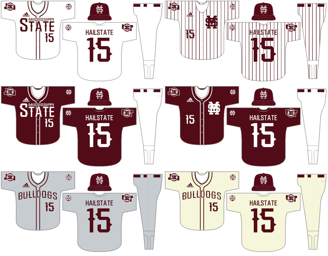
Mississippi State has the potential for a great baseball uniform set. They look good as it is, but a few simple tweaks and they could have a classic, untouchable look. Here, I've introduced a new, consistent number font. That same font has been applied to the "Mississippi State" wordmark and has been used to create a new "Bulldogs" wordmark. A Mississippi patch has been added to the sleeve of each jersey.
The white and maroon jerseys remain with the modified wordmark and number font. The pinstripe and maroon MS jerseys also remain, with the only change being the updated number font. The "Bulldogs" wordmark is applied to the cream jersey and to a new gray away jersey.
These changes, I believe, would unify Mississippi State's baseball brand. Adidas would be allowed to introduce two crazy alternates a year, for use in the SEC tournament only.
For more SEC Baseball concepts, click here: 2015 SEC Baseball Concepts


 RSS Feed