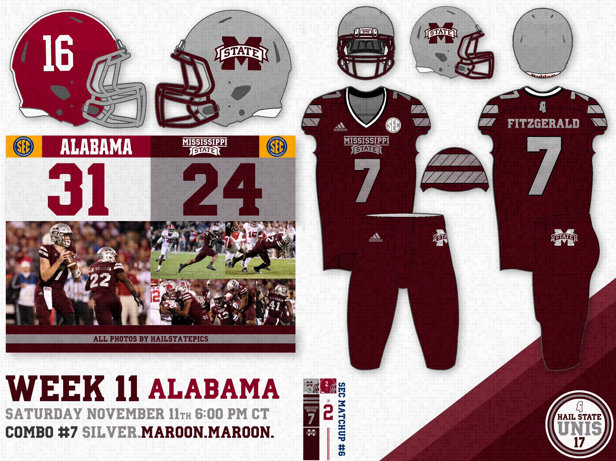
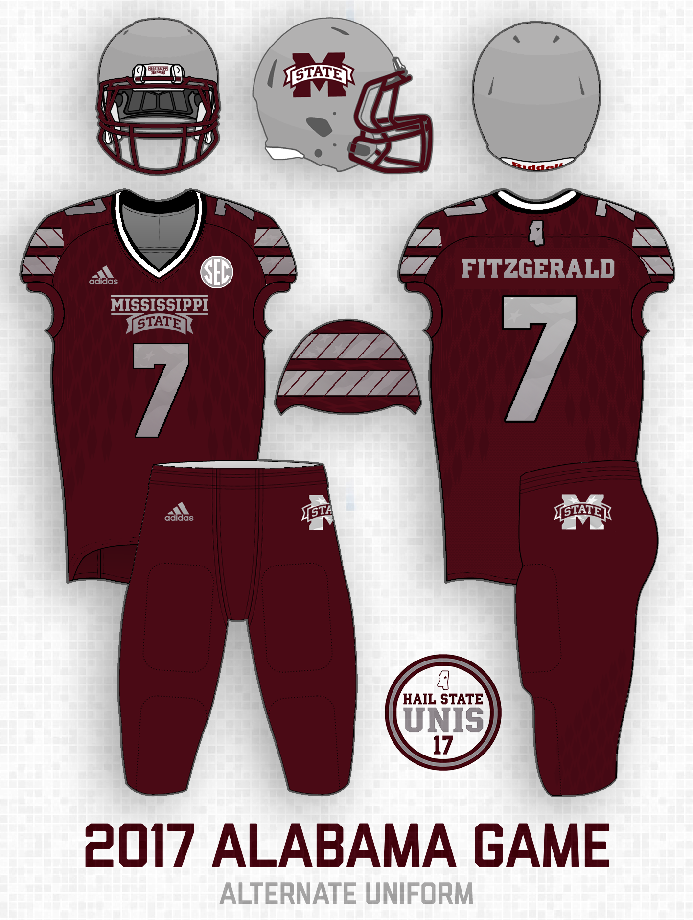
Helmet: Silver
Jersey: Maroon (Veterans Day)
Pants: Maroon (Veterans Day)
Jersey: Maroon (Veterans Day)
Pants: Maroon (Veterans Day)
We’ve done much worse, but we can do better. This applies to both the uniforms and the way the game turned out.
Monday morning, Mississippi State announced that they would be wearing Veterans Day themed alternate uniforms in this Saturday's top-16 matchup with the Alabama Crimson Tide. It marks the second year in a row that the Bulldogs have worn Adidas-designed Veterans Day uniforms, as well as the second week in a row that the Bulldogs will wear an alternate uniform. As is often the case with these things, the MSU fanbase has been polarized about the alternates on social media: some hate it, some love it, and some, like myself, are in-between.
Monday morning, Mississippi State announced that they would be wearing Veterans Day themed alternate uniforms in this Saturday's top-16 matchup with the Alabama Crimson Tide. It marks the second year in a row that the Bulldogs have worn Adidas-designed Veterans Day uniforms, as well as the second week in a row that the Bulldogs will wear an alternate uniform. As is often the case with these things, the MSU fanbase has been polarized about the alternates on social media: some hate it, some love it, and some, like myself, are in-between.
|
|
First, let's look at the good things about this uniform:
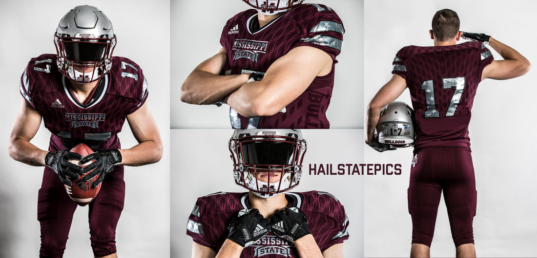
- The stars and stripes design on the numbers and sleeve stripes is subtle enough that it actually look good; they're nearly silver, which matches the helmet quite nicely. Compared to last year, when the stars and stripes were plastered all over the shoulders, this year's design is downright tasteful. From afar, these just look like maroon and silver alternates. I give credit to Adidas here for kind of finding a medium that doesn't look awful.
- There is no oversized M-State pants logo! When the replica jerseys leaked last week, one of my concerns was that that it would give the huge logo, which was worn on last year's military appreciation uniforms (and on last week's black pants), a chance to return. Instead, there is a larger than normal, but still relatively small, logo on the left hip, similar to the one Texas A&M wore a couple weeks ago (that's actually the only design element these share with A&M's alternates. More on that later.) This bodes well for future alternates; I'd prefer we use matching stripes on all pants designs, but if we have to do something different, this placement is a pretty good option. Hopefully last week's game vs UMass was the last time the huge pants logo ever sees the field.
- The Adidas logo is back on the right chest instead of under the collar for the first time since 2014! After having the chest so cluttered up for so long, it looks odd having it spread out like it should be. The next time we update to a newer Adidas template, I wouldn't mind seeing the Adidas logo moved to this position on the regular uniforms.
- The silver helmets fit this uniform perfectly; State had originally planned to wear decals with stars and stripes on them for this game, but the stars and stripes were very poorly implemented on the design, as I lamented in the original version of this post. Thankfully, the Bulldogs ended up wearing the regular decals instead, vastly improving the overall look of the uniform and creating at least some consistency with the other uniforms worn this season.
My major gripe with these uniforms is that they clearly follow the 2015-16 maroon jersey template, not the updated 2017 template. Rather than being maroon or silver, the collar is black-white-black, the same as the one on the 2015-2016 maroon jerseys. There are black outlines on the sleeve stripes, also reminiscent of the 2015-16 maroon jerseys, but they're barley visible against the shiny material of the stripes. This seems like more of a nitpick than anything, but it's something that Adidas should pay attention to and be consistent with.
Probably the most common criticism of these on social media was that they are "Texas A&M leftovers," or something to that effect. This claim is mostly based on the fact that the primeknit pattern really stands out on the reveal video and promo shots, similar to how it did on A&M's alternates a couple of weeks ago. During the game, however, the primenkit pattern was no more noticeable than it is on State's other jerseys. So, other than the hip logo location as mentioned above, and the fact that they both feature maroon jerseys and pants, these don't actually share any design elements with A&M's alternates, which didn't have sleeve stripes or a stars and stripes pattern.
Probably the biggest debate about these are whether or not they should even exist. Pretty much everyone agrees that honoring veterans is a great thing to do, and I'm proud of Mississippi State for doing it. The question at hand is whether gaudy alternate uniforms are the way to do it. This question has actually sparked a rather hot debate on social media, and it's a debate that I'm not going to delve into since it can get political very quickly. The one thing that I will say is that if you are going to honor veterans in this way, then the design should be held to the highest standard and the attention to detail should be a bit higher than it was with these.
Another thing that I don't love about these is that they make for two weeks in a row that State will be wearing alternate uniforms at home. If they do gold-accented Egg Bowl uniforms again this year, which is very possible, then the Kentucky game on October 21 could have potentially been the last time we see the regular maroon jerseys this season, which is crazy, especially when the regular maroon jerseys look as good as they do this year. Of course, the reason that Saturday is Military Appreciation Day is because Saturday is also Veterans Day. Last season, the Bulldogs played on the road on Veterans Day, so the black uniforms and Military Appreciation uniforms were combined into one, which resulted in what is probably the worst Mississippi State football uniform ever. That being said, if you replaced all of the maroon in this year's Military Appreciation uniforms with black, they would be magnitudes better than last year's.
|
|
|
|
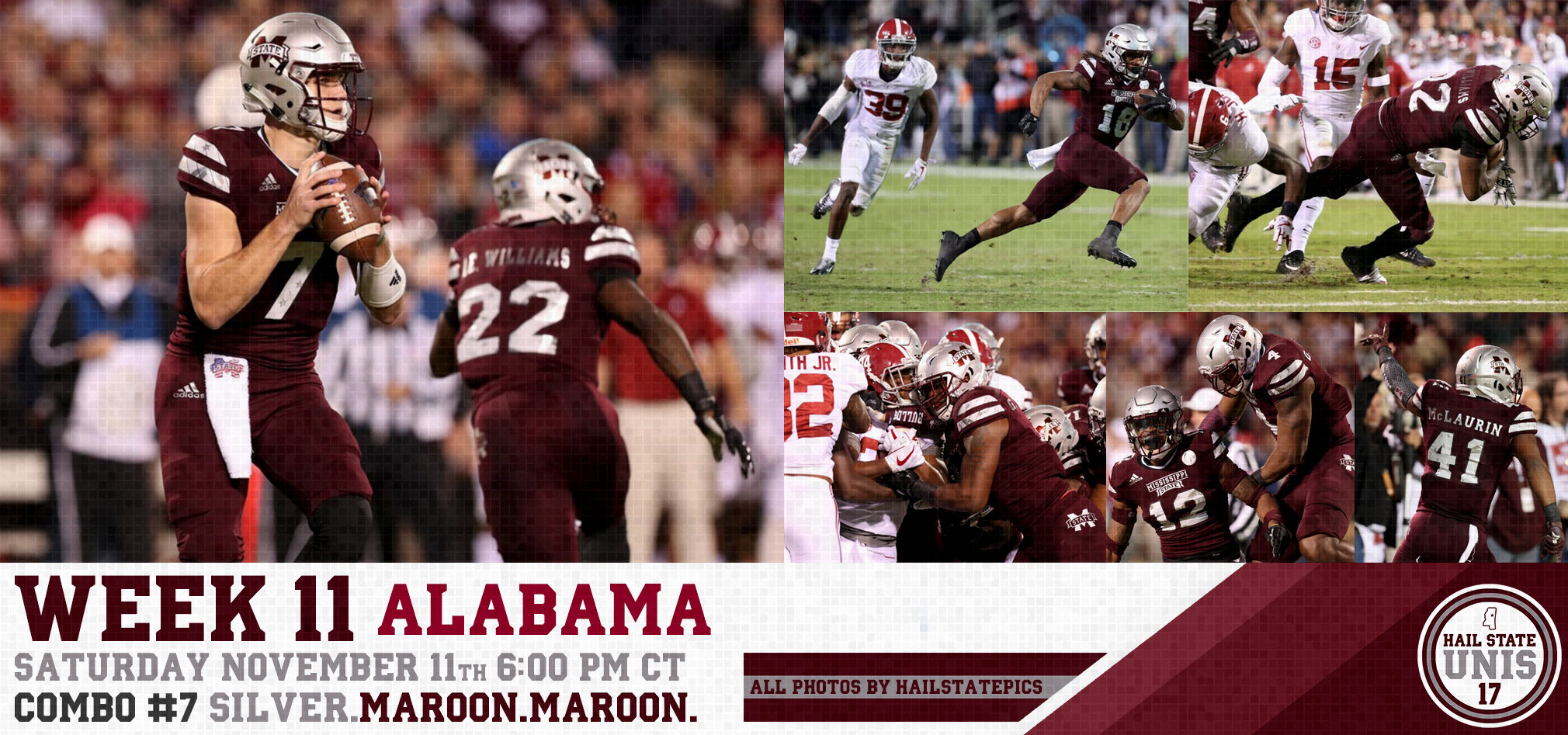
Another problem with the timing of these is that it somewhat ruins what would have been a great uni matchup with Alabama. I've always said that you don't want to wear an alternate uniform against a team like Alabama because it's a lose-lose situation uniform wise: if you lose, you looked silly and lost, and if you win, you didn't look like yourself while doing it. Additionally, with it being against the #2 team in the country, this is probably the most national exposure State will get all year, and we'll barely even look like ourselves. But again, there's not anything you can do about the timing if the whole point is to wear the uniforms on Veterans Day.
One positive thing about wearing this combination against Alabama is that it is similar to the combination State wore in its last win over Alabama, 10 years ago in 2007. That game, State wore maroon jerseys and pants, but not maroon helmets, just like they are this year. Since the switch to primary maroon helmets in 2009, State has only worn monochrome maroon with a non-maroon helmet once: the 2013 Egg Bowl, in which they wore chrome gold helmets and won the game in overtime.
One positive thing about wearing this combination against Alabama is that it is similar to the combination State wore in its last win over Alabama, 10 years ago in 2007. That game, State wore maroon jerseys and pants, but not maroon helmets, just like they are this year. Since the switch to primary maroon helmets in 2009, State has only worn monochrome maroon with a non-maroon helmet once: the 2013 Egg Bowl, in which they wore chrome gold helmets and won the game in overtime.
|
|
Overall, these uniforms are far better than last year's Military Appreciation uniforms, and they certainly have some redeemable elements (more than many Adidas alternates have had.) I'll be honest, they didn't look bad at all on the field, especially while State was winning; the stars and stripes were subtle enough that it looked like they were just wearing maroon and silver alternates. The minor inconsistencies were hardly noticeable, and the decision to go with the regular decals on the silver helmets solidified these as one of our better alternates. Still, they weren't in the same ballpark as our regular uniforms, and as the #16 team hosting the #2 team in the national spotlight, I do wish we would stick to our excellent traditional look. But it is what it is; it could certianly be worse, but it could also be better. Hail State.
 RSS Feed