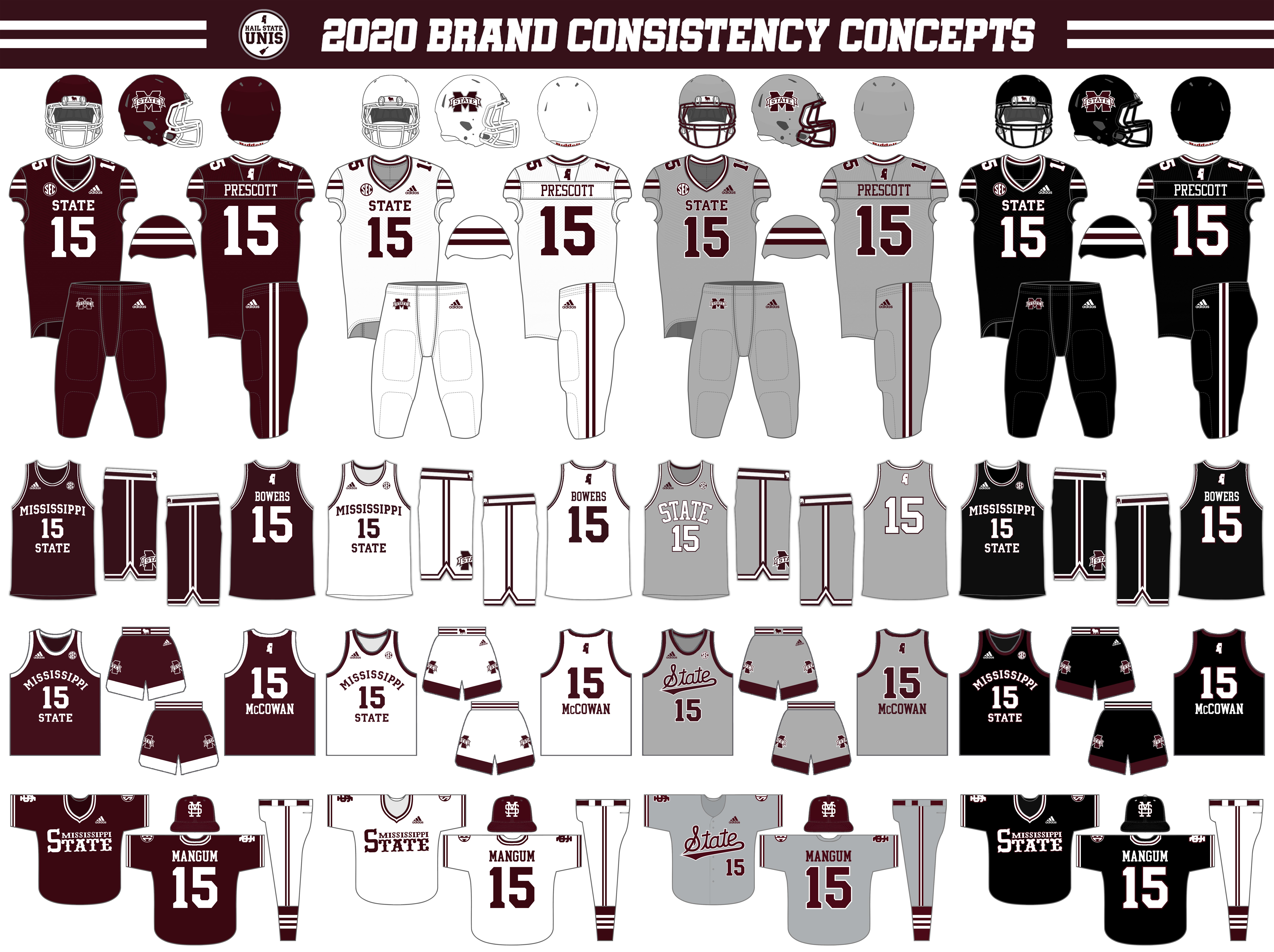
As the quarantine summer comes to a close, I finally sat down and finished a concept series I'd had on my mind for a few months. This concept series imagines State re-designing the uniforms for all of its major sports, balancing across-the-board consistency with historic elements in each individual sport.
The basic idea behind these concepts is that, among State's "big 4" sports, baseball has, by a wide margin, the Bulldogs' best uniforms. Baseball is, both historically and recently, Mississippi State's most successful sport, and the Bulldogs' classic baseball uniforms reflect that. Recently, under coach Chris Lemonis, the Bulldogs have embraced a "double stripe" striping pattern on its primary baseball uniforms- the white 85 tops and white pants both feature double maroon stripes and the maroon 85 tops feature double white stripes. Additionally, the black 85 tops feature white/maroon/white stripes, while the new gray "script" uniforms feature maroon/white/maroon stripes on both the sleeves and pants. With this concept, I take these striping patterns and apply them to the Bulldogs' uniforms in the other 3 major sports.
Another thing I wanted to do with this concept is eliminate the "banner" wordmark logo that appears on the center chest of the football, men's basketball, and women's basketball uniforms. This is something that I've seen a lot of fans asking for, and while I'm not necessarily advocating for it to happen, this provides a look at how it could be done.
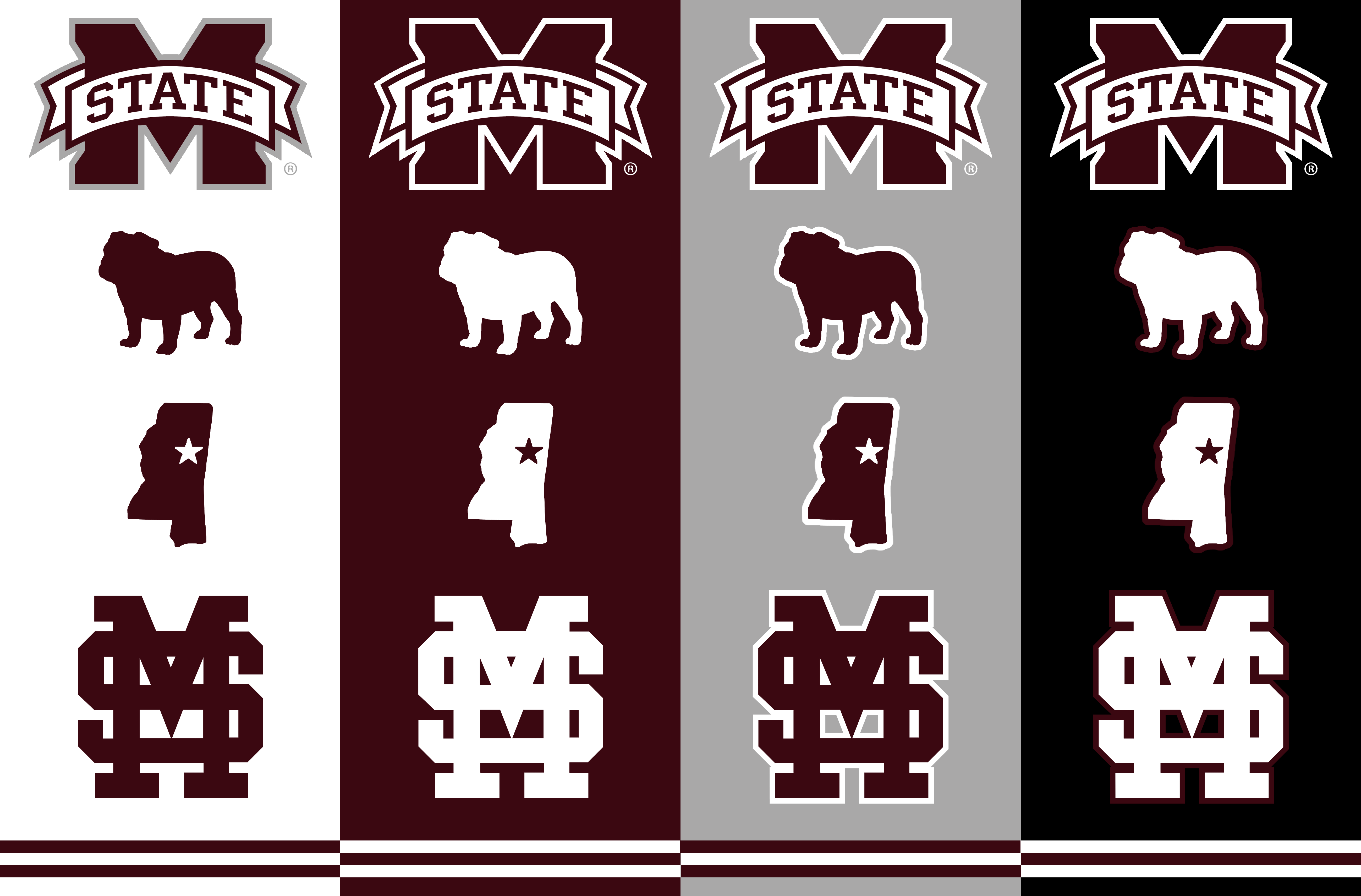
This concept embraces consistency through the aforementioned striping patterns, alongside font usage and logo/emblem application. The university's custom font is used for all uniform numbers and front chest wordmarks, and a single standard block font is used for player names. In addition to the standard M-State and M over S logos, two emblems are used throughout the uniforms in this concept: an outline of the state of Mississippi, with a star over the city of Starkville, and a silhouette of a standing bulldog (which was used as helmet reward stickers in the 2018 and 2019 football seasons).
A logo sheet with preferred applications is shown below:
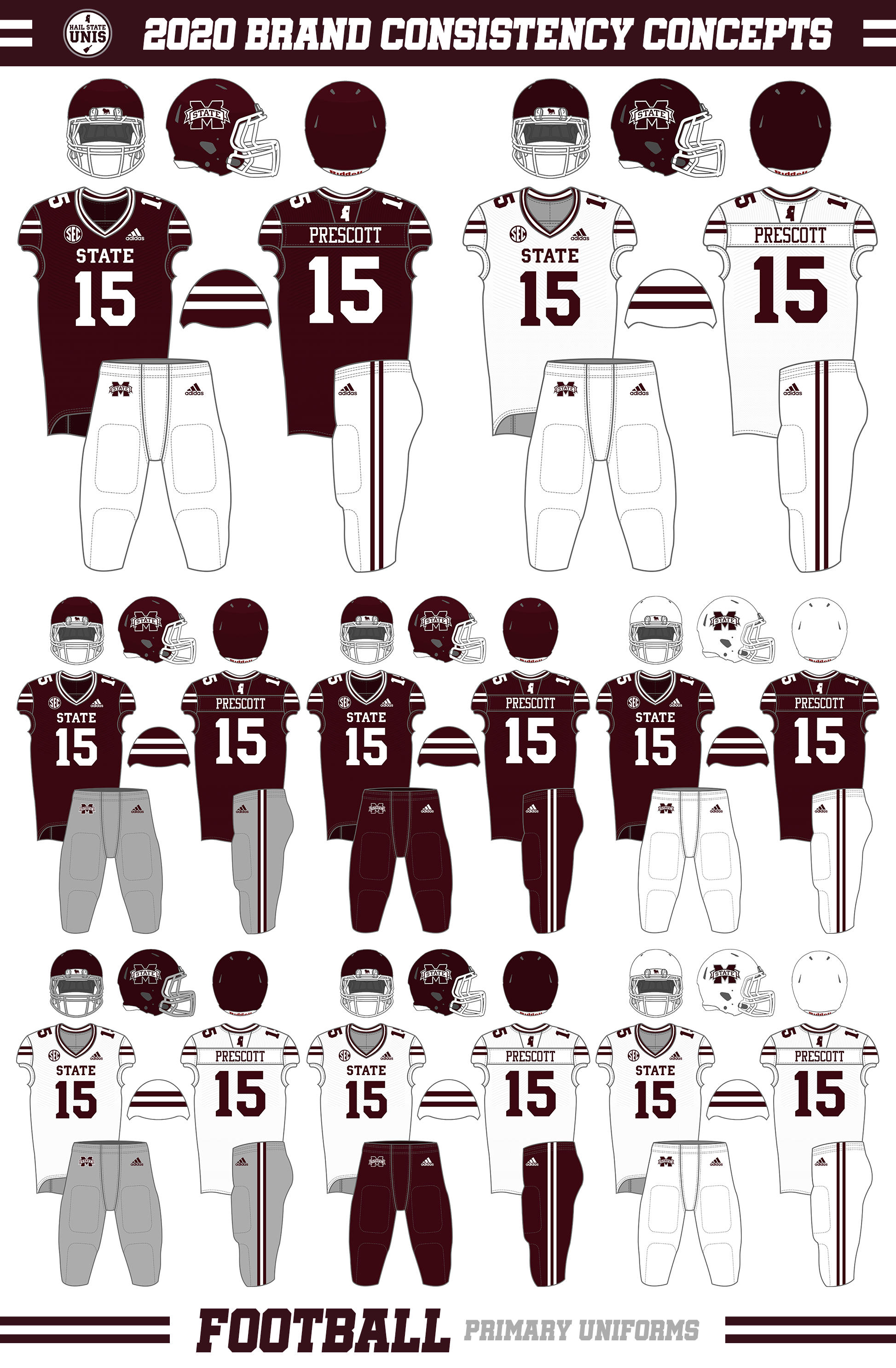
Football
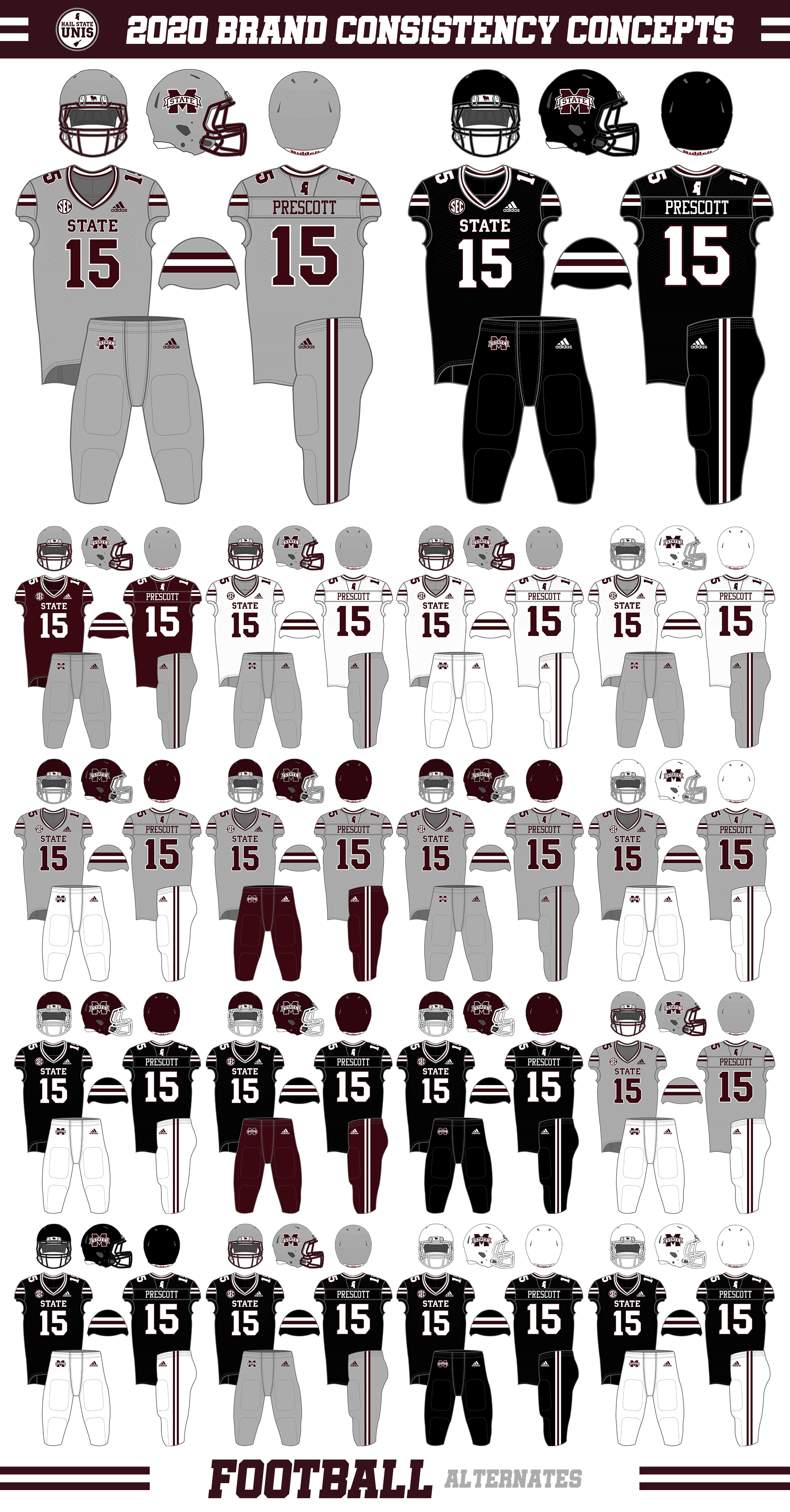
This football concept is very much along the same lines as the 2020 "Stretch Goals" concept I did back in January, with similar elements such as a simple "STATE" on the chest, thinner stripes and numbers, and tweaking the matte maroon helmet design.
However, this concept takes things a step further, all but eliminating gray from the primary uniforms, bringing things in line with the baseball striping patterns, and lightening the gray that remains (on the gray pants and M-State logo outline on the white pants and helmet).
The resulting uniform set is one featuring thin, contrasting double stripes on the sleeves, collar, and pants, a simple block "STATE" on the chest, and primarily only maroon and white. The striping patterns make this set a quasi-throwback to the 1969 to 1971 set (opening up the possibility for potential "Flying M" throwbacks?). The primary helmets are the current glossy maroon design; the white helmets are retained as is, and the matte maroon helmets, which would primarily be worn on the road, have all silver elements replaced with white (though the silver facemasks could return for the M/W/G combination).
For alternates, this concept includes an example of an all-gray alternate as well as an all-black alternate. These uniforms have the same basic design as the primary uniforms, with the appropriate baseball-style striping patterns. Silver helmets would be eligible to make their return, and a brand new matte-black helmet option is shown. 16 "alternate" non-traditional combination options are shown, most utilizing silver helmets, gray jerseys, or black jerseys.
Men's Basketball
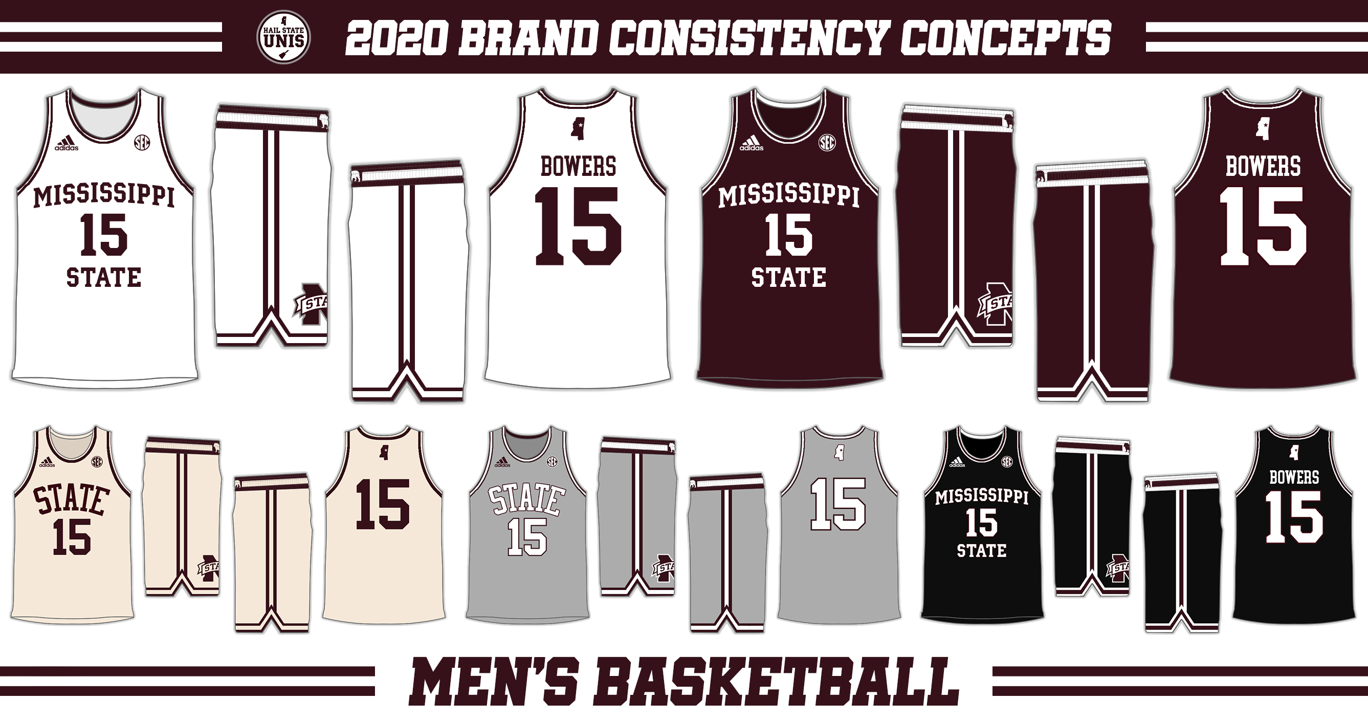
As with football, I took heavy inspiration from a previous men's basketball concept for this project. That concept was my 2021 Basketball Uniforms Concept from April, where I crafted an all-new look that combined the Bulldogs' 1996 Final Four jerseys with the Game Of Change era shorts.
This concept sticks to those ideas for the most part with a few small changes. The most notable is the font on the white, maroon, and black uniforms, which is reverted back to the custom university font. Additionally, the Bulldog silhouette has been added to the belt buckle area on all five uniforms.
The cream uniforms are essentially the same as the ones that have been worn throughout the entire Howland era; the proposed new gray, which follow the same template, are based on the ones ones by the Bulldogs in the late '80s. You may notice, particularly on the compilation image at the top of this post, that the gray uniforms "violate" the inter-sport consistency in that they feature primarily white accents outlined in maroon, whereas the gray uniforms in other sports feature primarily maroon accents outlined in white. Given the historical nature of these uniforms, I felt it was appropriate to "break" consistency here for what looks best and what is most historically accurate. Consistency can still be found in the shorts and collar/sleeve striping.
Women's Basketball
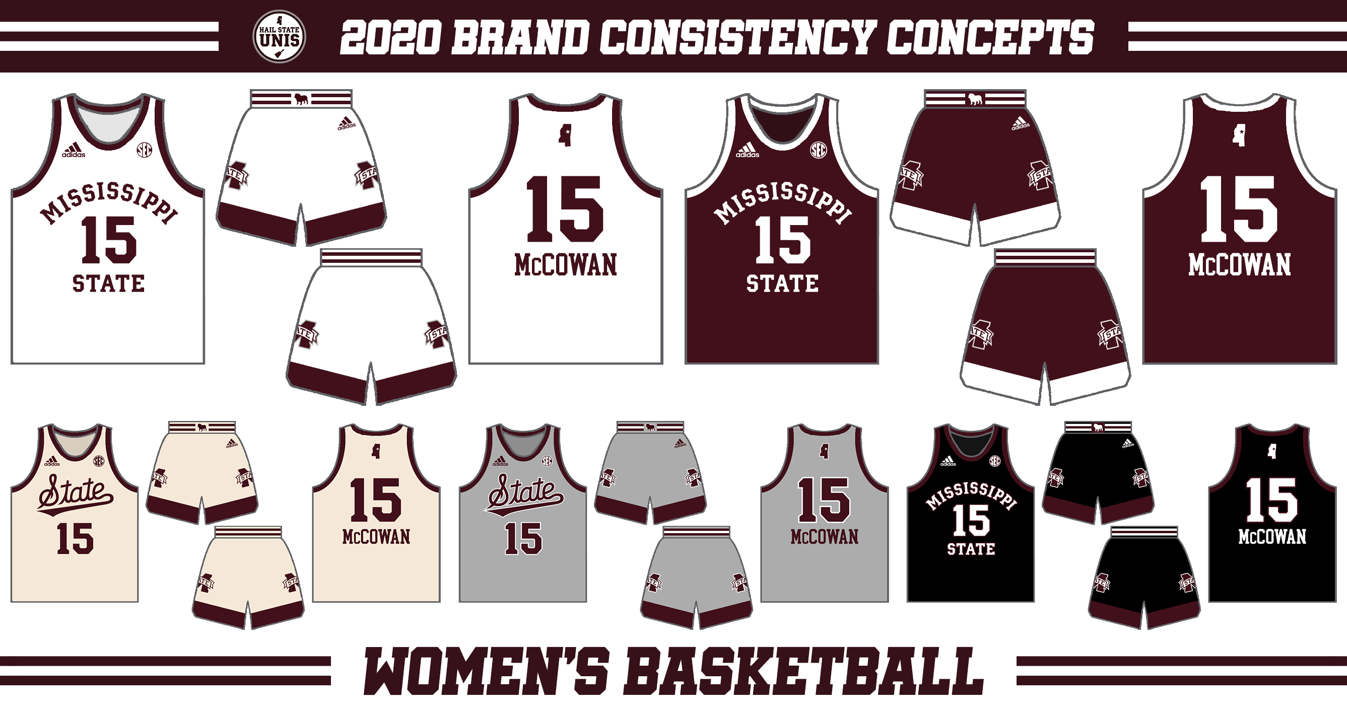
This was the only concept that was really done "from scratch," but I was really pleasantly surprised by how it turned out. These uniforms combine elements from multiple eras of Mississippi State women's basketball history, as well as maintain some consistency with the other uniform sets.
The first thing you might notice is the re-designed front of the uniform. On the white, maroon, and black uniforms, the front of the uniforms feature an arched "Mississippi" over the player number and a straightline "State". Though not an exact match, this style is a callback to the Latoya Thomas and Tan White era style. The alternate gray and cream uniforms feature the script "State" logo that is currently used on solid gray and white pinstripe baseball uniforms- this is a mark that I think works really well in this context and could stand to be used more throughout State's athletic marketing.
The collar/sleeves and bottom of the shorts feature thick contrasting piping/panels. This is a callback to the uniforms worn in the 2018-2019 season, in which the Bulldogs won both the SEC Regular Season and Tournament titles. Having that contrasting panel on the bottom of the shorts is also reminiscent of the uniforms worn in the 2017 postseason, which saw the Bulldogs snap UConn's 111 game winning streak en route to the first National Championship appearance in program history.
The waistband on the shorts of these uniforms feature the baseball-style striping pattern, while the belt buckle features the Bulldog silhouette. These elements, along with the nubmer/wordmark font and State outline on the back of the jersey, create sufficient consistency with the other uniform sets in this concept series.
That concludes this concept series- I'm very happy with how it turned out- that compilation image at the top is just so satisfying! You may be wondering why there's no baseball section; I thought about making one, but there's really no use in doing so, as the whole point behind this concept is bringing all of the other sports up to speed with baseball, which is the only sport at Mississippi State that really has uniforms figured out. In this world, baseball would keep the four uniforms shown in the compilation image, as well as white and gray pinstripes, and maybe rotate some cream uniforms in there every now and then.
Hail State!
Hail State!
 RSS Feed